Hamburger_menu.svg

Top 100 CSS interview questions and answers for 2024

If you want to work as a successful CSS developer for a top Silicon Valley firm or build a team of talented CSS developers, you've come to the right spot. We've carefully compiled a list of CSS developer interview questions for your CSS interview to give you an idea of the kind of CSS interview questions you can ask or be asked.

Last updated on Apr 25, 2024

Cascading Style Sheets (CSS) serve a vital role in web development for building aesthetically pleasing and interactive web pages. A good understanding of CSS concepts and practical knowledge is necessary for both applicants preparing for CSS interviews and hiring managers evaluating candidates' abilities. This post will give you a thorough list of CSS interview questions, whether you're seeking to brush up on your CSS skills or prepare for a forthcoming interview. We've got you covered on everything from fundamentals to advanced topics.

Let's get started and look at some of the most important CSS interview questions that can help you succeed in your next CSS endeavor.

Basic CSS interview questions

1.

What is CSS and what is its purpose?

CSS, or Cascading Style Sheets, is a stylesheet language used for describing the look, formatting, and layout of documents written in HTML (Hypertext Markup Language) or XML (Extensible Markup Language). Its primary purpose is to separate the presentation and design of a web page from its content, making it easier to maintain, update and modify the visual appearance of a website.

The main benefits of CSS include:

  • Consistency: By using a single CSS file to control the styles for multiple pages, you can create a consistent look and feel across an entire website.
  • Efficiency: CSS reduces code duplication and makes it easier to manage and update styles. This leads to faster page-load times and lower bandwidth usage.
  • Modularity: With CSS, you can break courses down into modules that can be easily reused, combined, and updated independently of each other.
  • Accessibility: CSS helps create accessible web pages by allowing developers to apply specific styles for different types of devices or user preferences.
  • Flexibility: CSS offers a wide range of styling properties and techniques that can be used to achieve various effects, catering to diverse design requirements.

2.

What are the different ways to include CSS in a web page?

There are three main ways to include CSS in a web page:

  • Inline CSS: Adding the style directly to an HTML element using the "style" attribute.
  • Internal CSS: Placing the CSS code within the < style > tags in the < head > section of an HTML document.
  • External CSS: Linking an external CSS file to the HTML document using the < link > tag in the < head > section.

3.

How do you select an element with a specific class in CSS?

To select an element with a specific class in CSS, you use the dot (.) followed by the class name. For example, to select all elements with the class "example-class", the CSS selector would be ".example-class".

4.

What is the box model in CSS?

The Box Model in CSS refers to the concept that organizes and structures HTML elements on a web page in the form of rectangular boxes. Every element in a page is comprised of a rectangular box, which includes content, padding, border, and margin. These components contribute collectively to the element's dimensions and positioning.

  • Content: The actual text or images inside the element.
  • Padding: The space between the content and the border, working as a cushion around the content.
  • Border: The line enclosing the padding and content, which visually defines the boundaries of the element.
  • Margin: The space surrounding the border, which helps to space out elements from each other and other sections of the page.

Together, these elements determine the total dimensions and layout of an HTML element on a web page. The Box Model is crucial for controlling the placement and appearance of content when designing a web page using Cascading Style Sheets (CSS).

5.

How do you center an element horizontally in CSS?

To center an element horizontally in CSS, you can use one of the following methods:

  • Set the left and right margins to "auto" and specify a width for the element.
  • Use the flexbox layout by setting the parent container's "display" property to "flex" and using the "justify-content" property with a value of "center".

6.

How do you change the background color of an element in CSS?

To change the background color of an element in CSS, you use the background-color property and set it to the desired color. You can use color names, hexadecimal values, RGB, or HSL values as the color value. Here's an example of how to set the background color of an element with a class name "example":

.example {
  background-color: red; /* color name */
  /* or */
  background-color: #ff0000; /* hexadecimal value */
  /* or */
  background-color: rgb(255, 0, 0); /* RGB value */
  /* or */
  background-color: hsl(0, 100%, 50%); /* HSL value */
}

Apply the class to an HTML element:

<div class="example">
  This element's background color is red.
</div>

7.

What is the difference between padding and margin in CSS?

In CSS, padding and margin are properties that control the space around an element, but they serve different purposes:

  • Padding: This property defines the space between the content of an element and its border. It is usually used to create extra space around the content inside an element. Padding is included within the background color or background image of the element and holds the border outside the actual content.
  • Margin: This property defines the space around the outside of an element, between the element and its surrounding elements. It is used for creating space between elements, and it is transparent. Margin is situated outside the border, so if an element has a background color or image, it won't influence the margin.

8.

How do you add a border to an element in CSS?

To add a border to an element in CSS, you need to set the border property, which is a shorthand for three individual properties: border-width, border-style, and border-color. You can specify all three properties in a single declaration or set them individually.

Here's an example of how to add a border using the shorthand property:

.box {
  border: 2px solid red; /* border-width, border-style, and border-color */
}

Or you can set the properties individually:

.box {
  border-width: 2px;
  border-style: solid;
  border-color: red;
}

Both of these examples will result in a red, solid border with a width of 2 pixels around an element. To apply the style, add the class to an HTML element:

<div class="box">This element has a solid red border of 2 pixels width.</div>

The border property allows you to style borders with different widths, styles (e.g., solid, dashed, dotted, etc.), and colors. You can also control the border for individual sides (top, right, bottom, and left) using specific properties like border-top, border-right, border-bottom, and border-left.

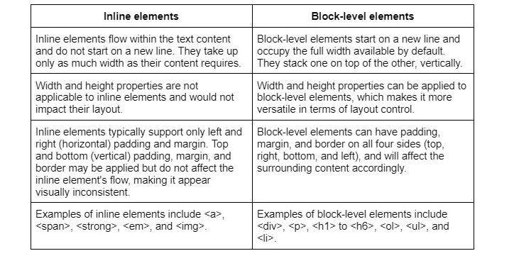
9.

What is the difference between inline and block-level elements in CSS?

In CSS, elements can be categorized as either inline or block-level based on their default display behavior within the HTML document. Here are the key differences:

Difference between inline and block elements.jpg

10.

How do you apply CSS styles to only the first letter of a paragraph?

To apply CSS styles to only the first letter of a paragraph, you can use the ::first-letter pseudo-element. It allows you to target and style the first letter of a text element without altering the HTML structure. Here's an example:

p::first-letter {
  font-size: 2em;
  font-weight: bold;
  color: blue;
}

In this example, the first letter of every < p > (paragraph) element will be styled with a larger font size (2 times the normal font size), bold font-weight, and blue color.

11.

What is the purpose of CSS selectors?

CSS selectors are patterns used to identify and select HTML elements to which specific styles should be applied. The main purpose of CSS selectors is to target elements on a web page based on their attributes, positions, or relationships with other elements so that you can apply styling rules to them.

12.

How do you apply CSS styles inline?

To apply CSS styles inline, you can use the ‘style’ attribute directly on an HTML element. Inline styles are written as part of the element's opening tag, and the CSS properties are defined within the ‘style’ attribute. Here's an example:

<p style="font-size: 18px; color: red; font-weight: bold;">This paragraph has inline CSS styles applied to it.</p>

In this example, the ‘< p >’ element has inline styles that set the font size to 18 pixels, the color to red, and the font weight to bold.

Keeping in mind that inline styles have the highest specificity among all CSS selectors, meaning they will override any styles defined in an internal or external stylesheet unless the ‘!important’ flag is used in the other styles. However, using inline styles is generally not recommended as they can make your HTML code harder to maintain. It is better to use external or internal stylesheets when possible.

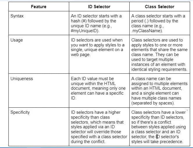
13.

Explain the difference between an ID selector and a class selector in CSS.

In CSS, ID selectors and class selectors are used to apply styles to HTML elements based on their attributes, but they have different use cases and characteristics:

Diff-between-ID-and-Class-selector.webp

14.

How do you change the font size of an element in CSS?

To change the font size of an element in CSS, you can use the font-size property. The font-size property can accept various units like px (pixels), em, rem, % (percentage), and more. Here's an example of how to set the font size for different elements:

/* Using pixels (absolute unit) */
p {
  font-size: 16px;
}

/* Using em (relative unit) */
h1 {
  font-size: 2em; /* 2 times the parent element's font-size */
}

/* Using rem (relative unit) */
h2 {
  font-size: 1.5rem; /* 1.5 times the font-size of the root element (<html>) */
}

/* Using percentage (relative unit) */
li {
  font-size: 110%; /* 110% of the parent element's font-size */
}

Apply the styles to the corresponding HTML elements:

<p>This paragraph has a font size of 16 pixels.</p>
<h1>This heading has a font size of 2 times the parent element's font size.</h1>
<h2>This heading has a font size of 1.5 times the root element's font size.</h2>
<li>This list item has a font size of 110% of the parent element's font size.</li>

15.

What is the float property used for in CSS?

The float property in CSS is used to position an element to the left or right of its containing element, allowing other elements to wrap around it. It is commonly used for creating layouts with multiple columns or for aligning images within text.

16.

How do you change the text color of an element in CSS?

To change the text color of an element in CSS, you use the color property and set it to the desired color. You can use color names, hexadecimal values, RGB, or HSL values as the color value. Here's an example of how to set the text color of an element with a class name "example":

.example {
  color: green; /* color name */
  /* or */
  color: #008000; /* hexadecimal value */
  /* or */
  color: rgb(0, 128, 0); /* RGB value */
  /* or */
  color: hsl(120, 100%, 25%); /* HSL value */
}

Apply the class to an HTML element:

<div class="example">
  The text color of this element is green.
</div>

17.

What is the CSS display property used for?

The CSS display property is used to control how an element is rendered on the page. It defines the display behavior of an element - whether it should be treated as a block-level element, an inline element, or other display types like flex or grid.

18.

How do you create a hyperlink style in CSS?

To create a hyperlink style in CSS, target the anchor element and apply the desired styles to the different hyperlink states - unvisited (link), visited, hover, and active. The common hyperlink states and their CSS pseudo-classes are:

  • :link - targets unvisited links
  • :visited - targets visited links
  • :hover - targets links when being hovered by the mouse cursor
  • :active - targets links when being clicked or activated by keyboard

Here's an example of creating a simple hyperlink style:

/* Unvisited link */
a:link {
  color: blue;
  text-decoration: none;
}

/* Visited link */
a:visited {
  color: purple;
}

/* Hover effect */
a:hover {
  color: red;
  text-decoration: underline;
}

/* Active link */
a:active {
  color: orange;
}

19.

Explain the difference between px, %, em, and rem units in CSS.

In CSS, different units of measurement are used to define lengths, dimensions, and sizes. Some commonly used units are px, %, em, and rem. Each has its own unique characteristics:

  • px (pixels): One of the most commonly used units, a px represents an absolute length or size in terms of screen pixels. 1px is equal to one dot on the screen. The actual physical size of a pixel may vary depending on screen resolution, but px provides a consistent measurement across devices and displays.
  • % (percentage): Percentage values are relative to another value, such as the width or height of a parent element. As a result, they offer a more fluid and responsive approach to sizing elements.
  • em: The em unit is relative to the font size of the element itself or the nearest parent element with a specified font size. 1em is equal to the current font size, so if the font-size of the document is 16px, then 1em will equal 16px.
  • rem: Similar to em, the rem unit is relative to the font size. However, rem is always relative to the base (root) font size of the document, usually defined on the element. This unit provides a consistent way to scale elements based on the overall font size of the page, without being affected by the font size of parent elements.

20.

How do you add a background image to an element in CSS?

To add a background image to an element in CSS, you use the background-image property. You'll need to provide the URL of the image file within the url() function as the property's value. Here's an example:

.selector {

background-image: url('path/to/image.jpg');

}

Replace .selector with the appropriate CSS selector for the element you want to apply the background image to, and replace 'path/to/image.jpg' with the actual path to the image file.

21.

What is the purpose of the CSS z-index property?

The CSS z-index property is used to control the stacking order of elements on a web page. Elements with a higher z-index value will appear in front of elements with a lower value. It is commonly used to layer elements and create overlays.

22.

How do you set the height and width of an element in CSS?

In CSS, you can set the height and width of an element using the height and width properties. These properties can be applied to most elements, except non-replaced inline elements and table columns.

Here's an example of how to set the height and width of an element:

.my-element {
  width: 200px;
  height: 100px;
}

In this example, the element with the class my-element has a width of 200 pixels and a height of 100 pixels. You can use different units, such as px (pixels), em, rem, % (percentage), and vw/vh (viewport units), depending on your design requirements.

23.

Explain the difference between position: relative; and position: absolute;.

position: relative; and position: absolute; are both CSS positioning properties that determine how an element is positioned in a webpage. They offer different methods for controlling an element's placement:

position: relative: When an element has position: relative;, its position is calculated based on its normal position in the document flow (i.e., its static position). You can then use the top, right, bottom, and left properties to adjust the element's position relative to its original location, without affecting the placement of other elements around it.

position: absolute: When an element has position: absolute;, it is taken out of the normal document flow and positioned relative to the nearest positioned ancestor element (the nearest element with a specified position other than static). If it does not have a positioned ancestor, the element is positioned relative to the initial containing block, usually the initial viewport or document body. You can use the top, right, bottom, and left properties to set the position of the absolute element relative to its positioned ancestor.

24.

How do you create a list without bullets in CSS?

To create a list without bullets in CSS, you need to target the list element(s) and set the list-style-type property to none. Typically, you will either work with unordered lists (< ul >) or ordered lists (< ol >). Here's how you can remove bullets (or numbers) from an unordered list:

ul {
  list-style-type: none;
}

This CSS rule targets all unordered lists (< ul >) in the document and removes the bullets by setting the list-style-type to none.

25.

What is the purpose of the CSS opacity property?

The CSS opacity property is used to control the transparency of an element. It accepts a value between 0 (completely transparent) and 1 (fully opaque). It can be used to create subtle transparency effects or fade animations.

26.

How do you align text to the center of an element in CSS?

To align text to the center of an element in CSS, you can use the text-align property with the value center. This will horizontally center the text within the specified container element. Here's an example:

CSS:

.center-text {
  text-align: center;
}

HTML:

<div class="center-text">
  This text is horizontally centered within the div.
</div>

In this example, the CSS rule targets any element with the class center-text and applies the text-align: center; styling to it. When you add the class center-text to an HTML element, the text content within that element will be horizontally centered.

27.

Explain the difference between nth-child() and:nth-of-type() selectors.

Both :nth-child() and :nth-of-type() are CSS pseudo-class selectors that allow you to target specific elements based on their position in a group of siblings. However, they differ in the way they determine which elements to select.

:nth-child() selects elements based on their position in the group of all sibling elements, regardless of their type (e.g., < div >, < p >, < li >). The syntax is :nth-child(an+b), where a and b are integers and n is a counter that starts from 0.

:nth-of-type() selects elements based on their position in a group of siblings with the same element type. The syntax for :nth-of-type() is almost identical to :nth-child(): :nth-of-type(an+b).

28.

How do you style all links within a specific container in CSS?

To style all links within a specific container in CSS, you can use the descendant selector. This allows you to target all the anchor elements () that are descendants of the container element, regardless of their nesting level.

Assuming that your container has a class called .container, you can apply styles to all the links within that container like this:

.container a {
  /* Your styles here */
  color: red; /* For example, change the link color to red */
}

In this example, all anchor elements (< a >) inside the .container element will have the text color set to red. You can replace .container with other selectors such as #container-id if your container is identified with an ID instead of a class.

29.

What is the CSS box-shadow property used for?

The CSS box-shadow property is used to add a shadow effect to an element. It allows you to control the shadow's color, size, blur, and position. By applying a box shadow, you can give depth and dimension to elements on the page.

30.

How do you create a horizontal navigation menu using CSS?

To create a horizontal navigation menu using CSS, you can follow these steps:

HTML:

First, define the HTML structure of the menu using an unordered list (< ul >) and list items (< li >). Wrap each list item in an anchor tag (< a >) to create a link:

<nav>
  <ul class="navigation-menu">
    <li><a href="#home">Home</a></li>
    <li><a href="#about">About</a></-li>
    <li><a href="#services">Services</a>li>
    <li><a href="#contact">Contact</a></-ti>
  </ul>
</nav>

CSS:

Next, apply CSS styles to convert the vertical list into a horizontal navigation menu:

/* Remove list style and padding */
.navigation-menu {
  list-style: none;
  margin: 0;
  padding: 0;
  display: flex; /* Display the list items in a row */
}

/* Style list items and links */
.navigation-menu li {
  margin: 0; /* Adjust margins as needed */
}

.navigation-menu a {
  display: block; /* Make the link fill the entire list item */
  padding: 10px; /* Add padding around the link text */
  text-decoration: none; /* Remove the default link underline */
  color: #000; /* Set link color */
}

/* Add hover effect on links */
.navigation-menu a:hover {
  background-color: #f2f2f2; /* Change the background color on link hover */
  color: #333; /* Change the link text color on hover */
}

In this example, we've created a basic horizontal navigation menu with links and a simple hover effect. You can modify the styles as needed to match your preferred design.

Tired of interviewing candidates to find the best developers?

Hire top vetted developers within 4 days.

Hire Now

Intermediate-level CSS interview questions

1.

Explain the concept of specificity in CSS.

The concept of specificity in CSS determines which styles will be applied to an element when there are conflicting rules. Specificity is calculated based on the selectors used in the CSS rules. It follows a specific hierarchy where inline styles have the highest specificity, followed by IDs, classes, and finally, element selectors.

The more specific a selector is, the higher its specificity value. When multiple conflicting rules target the same element, the one with the highest specificity will take precedence.

2.

What are CSS pseudo-classes? Give some examples?

CSS pseudo-classes are keywords added to selectors that specify a state or behavior of an element. They allow you to style elements based on their state or position in the document tree.

Here are some examples of CSS pseudo-classes:

  • :hover - applies styles when the element is being hovered over by the mouse.
  • :active - applies styles when the element is being activated by the user.
  • :first-child - selects the first child element of its parent.
  • :nth-child(n) - selects the nth child element of its parent.

3.

How do you create a responsive layout using CSS?

Several techniques can be used to create a responsive layout using CSS:

  • Use media queries to apply different styles based on the screen size or device.
  • Utilize flexible units like percentages or viewport-relative units like vw and vh.
  • Implement CSS Grid or Flexbox to create flexible and responsive grid-based layouts.
  • Use the max-width property to prevent elements from overflowing on smaller screens.
  • Make images and other media elements responsive by setting their max-width to 100%.

4.

What is the difference between display: none; and visibility: hidden;?

Both display: none; and visibility: hidden; are CSS properties used to hide elements on a webpage, but they do so in different ways:

  • display: none; - This property completely removes an element from the layout flow, as if the element is not present in the HTML document at all. Therefore, adjacent elements will take up the space that the hidden element would have occupied, causing the layout to reflow.
  • visibility: hidden; - This property hides an element while maintaining its space in the layout. The element is still part of the layout flow but will be invisible. Consequently, the layout does not reflow as adjacent elements won't take up the hidden element's space.

5.

How can you vertically align an element in CSS?

There are multiple ways to vertically align an element in CSS. Here are a few commonly used techniques:

  • Using the "display: flex;" property on the parent container and applying "align-items: center;" to vertically center the child elements.
  • Applying "position: absolute;" to the element and combining it with "top: 50%;" and "transform: translateY(-50%);" to center it vertically.
  • Utilizing CSS Grid and specifying the alignment properties on the grid container.

6.

How do you create a CSS sprite and what are its benefits?

A CSS sprite is an image composed of multiple smaller images, combined into a single file. This technique is used to reduce the number of HTTP requests by loading a single image file that contains multiple graphical elements, which can then be displayed across a webpage using CSS.

To create a CSS sprite, you combine multiple images into a single larger image and use CSS background positioning to display specific parts of the combined image as required. This technique helps reduce the number of HTTP requests made to the server, leading to faster page load times.

The benefits of CSS sprites include reduced bandwidth usage, improved performance, and better user experience.

7.

What is the difference between em and rem units in CSS?

Both em and rem are relative units of measurement in CSS, used to define sizes based on font or parent element sizes. They are useful for ensuring responsive designs and making it easier to adjust the overall layout.

em: The em unit represents the size relative to the font-size of the current element. In other words, if you set the font size to 2em, it means the font size will be 2 times the computed size of the font of the current element. When applied to elements other than font-size, em is still calculated based on the font-size of the current element.

rem: The rem unit represents the size relative to the font-size of the root element (). This means when you set a font size to 2rem, it is 2 times the font size defined in the root element, regardless of the current element's parent styles.

Key difference: The em unit depends on the font-size of the current element or its parent, which can lead to a compounding effect for nested elements. In contrast, the rem unit depends on the font-size of the root element, making it more consistent across the entire layout, without the nesting effect.

8.

How do you create a sticky/fixed header in CSS?

To create a sticky/fixed header in CSS, you can use the following approach:

  • Apply "position: fixed;" to the header element.
  • Set a suitable "top" or "bottom" value to position it at the desired location.
  • Specify "width: 100%;" to make it span the entire width of its containing block.
  • Adjust the z-index property as needed to ensure it appears above other elements.

9.

Explain the CSS float property and its usage.

The CSS float property is used to make an element float within its parent container, allowing other content to wrap around it. The float property accepts values like "left" or "right" to determine the direction of the float.

It was commonly used for creating layouts in the past, but nowadays, it is generally superseded by CSS Grid and Flexbox due to its more powerful layout capabilities.

10.

How can you override the default styles of a CSS framework?

To override the default styles of a CSS framework, you can follow these steps:

  • Use more specific CSS selectors to override the framework's styles. Add class or ID selectors to target specific elements and apply your desired styles.
  • Use the "!important" declaration on your styles to give them higher precedence. However, it's recommended to use this sparingly as it can lead to maintainability issues.
  • If possible, customize the framework by modifying its provided variables or using a custom build to generate a version of the framework with your desired styles.

11.

How do you apply CSS styles to only the last child of an element?

To apply CSS styles to only the last child of an element, you can use the ":last-child" pseudo-class selector. For example:

.parent-element :last-child {

/* CSS styles for the last child element */

}

12.

What is the purpose of CSS vendor prefixes? Give examples of some common ones.

CSS vendor prefixes are used to add support for specific CSS features in different web browsers. They are used before the standard property name and are specific to certain browser engines. Here are examples of some common CSS vendor prefixes:

  • -webkit- for WebKit-based browsers (Google Chrome, Safari)
  • -moz- for Mozilla-based browsers (Firefox)
  • -ms- for Microsoft browsers (Internet Explorer, Microsoft Edge)
  • -o- for Opera browser.

To add support for a CSS animation property, you can use:

.element {
  -webkit-animation: myAnimation 1s;
  -moz-animation: myAnimation 1s;
  animation: myAnimation 1s;
}

13.

How do you create a responsive image gallery using CSS?

To create a responsive image gallery using CSS, you can follow these steps:

  • Use a container element to wrap the gallery.
  • Set the container's display property to "flex" or "grid" to create a flexible layout.
  • Apply appropriate styles to the images, such as setting their width to a percentage value or using "max-width: 100%;" to ensure they resize with the container.
  • Use media queries to adjust the gallery's layout for different screen sizes or devices.

14.

Explain the concept of CSS inheritance and how it applies to different elements.

CSS inheritance is the process by which certain properties of an element are passed down from its parent elements. When a parent element has a defined style property, its child elements will inherit those styles unless overridden. Inheritance applies to properties like font-size, color, text-align, etc. However, not all properties are inheritable by default.

15.

How do you vertically center an element within its parent container in CSS?

To vertically center an element within its parent container in CSS, you can use one of the following methods:

  • Set the parent container's display property to "flex" and use "align-items: center;" to vertically align the child elements.
  • Combine "position: absolute;" with "top: 50%;" and "transform: translateY(-50%);" on the element to center it vertically.
  • Use CSS Grid and the align-self property to vertically center the element within the grid container.

16.

What is the CSS box-sizing property used for and what are its different values?

The CSS box-sizing property is used to control how the total width and height of an element are calculated. It has three possible values:

  • "content-box" (default): The width and height only include the content and exclude padding, border, and margin.
  • "border-box": The width and height include the content, padding, and border, but not the margin. This value makes it easier to work with element sizing.
  • "padding-box": The width and height include the content and padding but exclude the border and margin.

17.

How do you create a fixed footer that stays at the bottom of the page in CSS?

To create a fixed footer that stays at the bottom of the page in CSS, you can use the following approach:

  • Apply "position: fixed;" to the footer element.
  • Set "bottom: 0;" to position it at the bottom of the viewport.
  • Specify "width: 100%;" to make it span the entire width of the page.

18.

What are CSS pseudo-elements? Give examples of their usage.

CSS pseudo-elements are used to style specific parts of an element. They are denoted by double colons (::) and provide additional styling capabilities. Examples of CSS pseudo-elements include:

  • ::before: Inserts content before the element's content.
  • ::after: Inserts content after the element's content.
  • ::first-letter: Styles the first letter of the element.
  • ::first-line: Styles the first line of the element's content.

19.

How do you create a CSS dropdown menu?

To create a CSS dropdown menu, you can use a combination of CSS and JavaScript. Here is a basic approach:

  • Use a nested HTML structure with lists (ul and li) to represent the dropdown menu items.
  • Apply CSS styles to hide the dropdown menu initially (e.g., "display: none;").
  • Use CSS pseudo-classes, such as ":hover", on the parent element to show/hide the dropdown menu (e.g., "display: block;").
  • Optionally, use JavaScript to add additional functionality and interactions to the dropdown menu.

20.

Explain the concept of CSS grid layout and its advantages over other layout methods.

CSS grid layout is a powerful two-dimensional layout system that allows you to create complex grid-based layouts with ease. It provides control over both rows and columns, making it ideal for responsive designs. Some advantages of CSS grid layout include:

  • Simplified grid structure with easy alignment and positioning of elements.
  • Ability to create complex and flexible layouts without relying on additional frameworks or libraries.
  • Support for responsive designs with media queries and auto-placement of grid items.
  • Efficient use of whitespace and automatic adjustment of grid tracks based on content and available space.

21.

How do you hide an element visually but still allow it to be accessible to screen readers?

To hide an element visually but allow it to be accessible to screen readers, you can use the following CSS technique:

  • Apply the "clip-path: inset(50%);" property to the element. This clips the element to a 0x0 pixel size, effectively hiding it visually.
  • Combine it with other CSS techniques like "position: absolute;" and "overflow: hidden;" to ensure the element doesn't affect the layout.

22.

What is the purpose of the CSS transform property? Give examples of its usage.

The CSS transform property is used to apply transformations to elements such as scaling, rotating, skewing, or translating (moving) them. Examples of its usage include:

  • Scaling an element: "transform: scale(1.2);" increases the element's size by 20%.
  • Rotating an element: "transform: rotate(45deg);" rotates the element by 45 degrees clockwise.
  • Translating an element: "transform: translate(50px, 50px);" moves the element 50 pixels to the right and 50 pixels down.

23.

How do you create a sticky sidebar that scrolls with the content in CSS?

To create a sticky sidebar that scrolls with the content in CSS, you can use the following approach:

  • Apply "position: sticky;" to the sidebar element.
  • Set "top: 0;" or "bottom: 0;" to define where the sticky element should stick within its containing block.
  • Specify a suitable height or max-height for the sidebar and set "overflow: auto;" to enable scrolling when the content exceeds the available space.

24.

Explain the concept of the CSS calc() function and how it can be used.

The CSS calc() function allows you to perform calculations to determine the value of a property. It is particularly useful for sizing and positioning elements. Some examples of its use include:

  • Setting the width of an element based on a percentage minus a fixed pixel value: "width: calc(50% - 20px);"
  • Calculating the height of an element based on the viewport height minus a specific value: "height: calc(100vh - 100px);".

25.

How do you create a print-friendly CSS style sheet for a web page?

To create a print-friendly CSS style sheet for a web page, you can use media queries specifically targeting print media. Here are some considerations:

  • Define appropriate font sizes and colors for better readability on printed paper.
  • Remove unnecessary elements like navigation menus, sidebars, or ads that are not relevant in a printed version.
  • Adjust margins, paddings, and page breaks to ensure proper layout and avoid content cutoff.
  • Consider using print-specific CSS styles to optimize the appearance and readability of the printed page.

26.

What are the different ways to include custom fonts in a web page using CSS?

The different ways to include custom fonts on a web page using CSS are:

  • Use the @font-face rule to define a custom font and specify its source (either hosted on a server or provided as a local file).
  • Link to external font files using the tag, specifying the font type and source URL.
  • Utilize web font services like Google Fonts or Adobe Fonts which provide easy-to-use methods for including custom fonts on a web page.

27.

How do you create a CSS tooltip for displaying additional information?

To create a CSS tooltip for displaying additional information, you can use CSS pseudo-elements like "::before" or "::after" along with the "content" property. Here's a basic example:

.tooltip {
  position: relative;
}
.tooltip:hover::after {
  content: "Additional information";
  position: absolute;
  background-color: #333;
  color: #fff;
  padding: 5px;
  border-radius: 3px;
  bottom: 100%;
  left: 50%;
  transform: translateX(-50%);
}

28.

Explain the concept of CSS pseudo-classes and give examples of their usage.

CSS pseudo-classes are selector modifiers that allow you to target and style HTML elements based on their state, position within the document tree, or other characteristics, without the need to add additional classes or attributes to the markup itself. Pseudo-classes are applied by adding a colon ( : ) followed by the pseudo-class name after the selector.

Here are some common examples of CSS pseudo-classes and their usage:

  • :hover: This pseudo-class targets an element when the user hovers the cursor over it. It's often used to change the appearance of an element on hover, such as a link or button.
a:hover {
  color: red;
}
  • :focus: This pseudo-class targets an element when it receives focus, usually by clicking or navigating with the Tab key. It's commonly used to provide visual indication for form inputs or interactive elements.
input:focus {
  outline: none;
  border-color: blue;
}
  • :active: This pseudo-class targets an element when it's being activated (pressed or clicked). It's used to give the effect of user interaction, such as buttons being pressed.
button:active {
  background-color: darkgray;
}
  • :nth-child(n): This pseudo-class targets elements based on their position within their parent container. n can be a number, a keyword, or an equation, allowing for flexible targeting. It's commonly used to style every odd/even element or apply distinct styles at certain positions.
li:nth-child(odd) {
  background-color: lightgray;
}

li:nth-child(2n) {
  font-weight: bold;
}

29.

How do you create a responsive multi-column layout using CSS?

To create a responsive multi-column layout using CSS, you can use CSS Grid or Flexbox.

Here's an example using CSS Grid:

.container {
  display: grid;
  grid-template-columns: repeat(auto-fit, minmax(250px, 1fr));
  gap: 20px;
}

This creates a grid container with a minimum column width of 250 pixels and allows the columns to automatically adjust based on available space. The "1fr" unit ensures the columns take up equal space. The "gap" property adds spacing between the columns.

30.

What are CSS custom properties (variables) and how do you use them?

CSS custom properties, also known as variables, allow you to define reusable values that can be used throughout your CSS stylesheets. They are declared using the -- prefix and can be assigned values using the var() function. For example, to define a custom property:

:root {
  --primary-color: #ff0000;
}
And to use it:


.element {
  color: var(--primary-color);
}

31.

How do you create a responsive navigation menu using CSS media queries?

To create a responsive navigation menu, you can use CSS media queries to apply different styles based on the screen size. You would typically hide the regular menu on smaller screens and display a mobile-friendly menu instead. Here's an example:

/* Regular menu styles */
@media (max-width: 768px) {
  /* Mobile menu styles */
}

32.

Explain the concept of CSS grid layout and its advantages over other layout methods.

CSS grid layout is a two-dimensional grid-based layout system that allows you to create complex responsive layouts. It provides precise control over the placement and sizing of grid items. Some advantages of CSS grid layout over other layout methods like floats or flexbox are:

  • Grid items can be placed in any order, not just left-to-right or top-to-bottom.
  • Grid items can span across multiple rows and columns.
  • Grid layout simplifies the creation of responsive designs.
  • It allows for easy alignment and positioning of grid items.

33.

What is the CSS transform property used for? Provide examples.

The CSS transform property is used to apply transformations to an element, such as rotation, scaling, skewing, or translating. Here are some examples:

.rotate {
  transform: rotate(45deg);
}
.scale {
  transform: scale(1.5);
}
.skew {
  transform: skew(20deg, -10deg);
}
.translate {
  transform: translate(50px, 20px);
}

34.

How do you center an element both vertically and horizontally in CSS?

There are multiple ways to center an element both vertically and horizontally in CSS. One common method is to use the following CSS:

.element {
  position: absolute;
  top: 50%;
  left: 50%;
  transform: translate(-50%, -50%);
}

This positions the element at 50% from the top and left edges of its containing element and then uses the translate() function to move it back by 50% of its width and height, effectively centering it.

35.

What are CSS counters and how can they be used?

CSS counters allow you to increment or decrement values for specific elements, such as headings or list items. They can be useful for automatically numbering elements or creating custom counters for various purposes. Here's an example:

body {
  counter-reset: section;
}
h2::before {
  counter-increment: section;
  content: "Section " counter(section) ": ";
}

This example resets a counter on the body element and increments it for each h2 element. The content property is then used to display the counter value before each h2 element.

36.

Explain the concept of CSS specificity and inheritance in the context of the !important rule.

CSS specificity determines which styles are applied when conflicting styles are present. Specificity is calculated based on the type of selectors used and their order of appearance. Inheritance, on the other hand, allows certain properties of an element to be inherited by its children.

The !important rule is a declaration that gives a style the highest specificity and overrides any conflicting styles. However, it is generally recommended to avoid using !important as it can make styles harder to maintain and override.

37.

How do you create a CSS-only dropdown menu with nested submenus?

To create a CSS-only dropdown menu with nested submenus, you can use nested HTML lists (< ul > and < li >) and CSS selectors. Here's an example:

<ul class="menu">
  <li>
    <a href="#">Menu 1</a>
    <ul>
      <li><a href="#">Submenu 1</a></li>
      <li><a href="#">Submenu 2</a></li>
    </ul>
  </li>
  <li><a href="#">Menu 2</a></li>
</ul>

CSS

.menu ul {
  display: none;
}
.menu li:hover > ul {
  display: block;
}

This example hides the submenus by default (display: none) and displays them when hovering over their parent menu item (li:hover > ul { display: block; }).

38.

What are the CSS blend modes and how do you use them?

CSS blend modes allow you to define how elements blend with their background or other elements. They provide various blending options such as multiply, screen, overlay, and more. Blend modes are set using the mix-blend-mode property. Here's an example:

cssCopy code
.element {
  mix-blend-mode: multiply;
}

In this example, the element will blend with its background using the multiply blend mode.

39.

How do you create a responsive video player using CSS?

To create a responsive video player using CSS, you can use a combination of HTML video element and CSS styles. You can make the video player responsive by setting its width to 100% and using appropriate CSS to control the player controls and layout. Here's a basic example:

<div class="video-wrapper">
  <video controls>
    <source src="video.mp4" type="video/mp4">
    Your browser does not support the video tag.
  </video>
</div>

CSS

.video-wrapper {
  position: relative;
  padding-bottom: 56.25%; /* 16:9 aspect ratio */
  overflow: hidden;
}
.video-wrapper video {
  position: absolute;
  width: 100%;
  height: 100%;
}

This example sets the aspect ratio of the video wrapper using the padding-bottom technique and makes the video element fill the wrapper.

Tired of interviewing candidates to find the best developers?

Hire top vetted developers within 4 days.

Hire Now

Advanced CSS interview questions

1.

What is the CSS box-sizing property and how does it work?

The CSS box-sizing property is used to control how the width and height of an element are calculated, including its padding and border. The default value is content-box, which means the width and height only include the content and exclude the padding and border. However, when box-sizing is set to border-box, the width and height of the element will include the padding and border.

Here's an example:

.box {
  box-sizing: border-box;
  width: 200px;
  padding: 20px;
  border: 1px solid black;
}

In the above example, the total width of the .box element would be 200px, including the padding and border. Without box-sizing: border-box, the total width would be 242px (200px width + 20px left padding + 20px right padding + 1px left border + 1px right border).

2.

How do you implement CSS animations and transitions?

CSS animations and transitions allow you to add dynamic effects to elements. CSS animations are used to create more complex animations with keyframes, while transitions provide smooth property changes over a specified duration.

Here's an example of CSS animation and transition:

/* CSS Animation */
@keyframes slide-in {
  0% {
    transform: translateX(-100%);
  }
  100% {
    transform: translateX(0);
  }
}
.element {
  animation: slide-in 1s ease-in-out;
}
/* CSS Transition */
.element {
  transition: width 0.3s ease-in-out;
}
.element:hover {
  width: 200px;
}

In the above example, the CSS animation slide-in is applied to the .element class which animates the element to slide in from the left side. The CSS transition is applied to the .element class as well, causing the width of the element to smoothly transition to 200px when hovered.

3.

What are CSS preprocessors? Name a few popular ones.

CSS preprocessors are tools that extend the functionality of CSS by adding features like variables, nesting, mixins, and functions. They allow you to write more maintainable and reusable CSS code.

Some popular CSS preprocessors are:

  • Sass (Syntactically Awesome Style Sheets)
  • Less (Leaner CSS)
  • Stylus

Here's an example of using variables in Sass:

$primary-color: #ff0000;
$secondary-color: #00ff00;
.element {
  color: $primary-color;
  background-color: $secondary-color;
}

In the above example, Sass variables $primary-color and $secondary-color are used to define colors, which can be easily reused throughout the codebase.

4.

How do you create a multi-column layout in CSS?

To create a multi-column layout in CSS, you can use the column-count property to specify the number of columns and the column-gap property to set the gap between the columns. Here's an example:

.container {
  column-count: 3;
  column-gap: 20px;
}

In the above example, the .container class creates a three-column layout with a gap of 20 pixels between each column. The content inside the container will automatically flow into multiple columns based on the available space.

5.

Explain the concept of CSS specificity and inheritance.

CSS specificity refers to the set of rules that determines which CSS styles should be applied to an element when multiple styles are defined. It is a way of resolving conflicts when different selectors target the same element.

CSS inheritance, on the other hand, allows styles to be passed from parent elements to their descendants. Inherited properties are applied to child elements unless overridden by specific styles.

The specificity of a selector is determined by the combination of its components such as element type, class, ID, and inline styles. Specificity is calculated based on a scoring system, where certain components have higher weight than others.

For example, in the selector h1.title, the class component (.title) has a higher specificity than the element type (h1).

6.

How do you optimize CSS for better website performance?

To optimize CSS for better website performance, you can follow these practices:

  • Minify and compress CSS files to reduce their file size.
  • Combine multiple CSS files into a single file to reduce HTTP requests.
  • Use CSS sprites to combine small images into a single larger image and reduce the number of image requests.
  • Avoid using inline styles and opt for external stylesheets.
  • Use shorthand properties to reduce the amount of CSS code.
  • Remove unused CSS to reduce the file size and improve loading speed.
  • Avoid using complex selectors that can slow down the rendering process.
  • Load CSS files asynchronously or defer their loading to prevent render-blocking.

Implementing these optimizations can significantly improve the loading speed and overall performance of a website.

7.

What are CSS media queries and how are they used?

CSS media queries are used to apply different CSS styles based on the characteristics of the device or viewport. They allow you to create responsive designs that adapt to different screen sizes and orientations.

Media queries can also be used to target specific device features like orientation, resolution, and aspect ratio, allowing you to create more tailored styles for different devices.

Here's an example of using a media query to apply different styles for screens smaller than 600 pixels:

@media (max-width: 600px) {
  .element {
    font-size: 14px;
  }
}

In the above example, the .element class will have a font size of 14 pixels only when the screen width is 600 pixels or less.

8.

Explain the different values of the CSS position property.

The CSS position property is used to control the positioning of an element. It has several possible values:

  • static: The default value. The element follows the normal flow of the document.
  • relative: The element is positioned relative to its normal position. It can be moved using the top, right, bottom, and left properties.
  • absolute: The element is positioned relative to its closest positioned ancestor. If no positioned ancestor exists, it is positioned relative to the initial containing block.
  • fixed: The element is positioned relative to the viewport. It remains fixed even when the page is scrolled.
  • sticky: The element is positioned based on the user's scroll position. It behaves like a relative until a specified threshold is reached after which it becomes fixed.

9.

How do you handle browser compatibility issues in CSS?

To handle browser compatibility issues in CSS, you can follow these approaches:

Use CSS vendor prefixes for properties that are not fully supported across different browsers. For example, -webkit- prefix for WebKit-based browsers like Chrome and Safari, -moz- prefix for Mozilla Firefox, etc. However, it's recommended to use autoprefixer tools or CSS preprocessors that automatically add necessary prefixes based on your browser support configuration.

Test your CSS on different browsers and devices to identify and fix any rendering issues.
Use feature detection libraries like Modernizr to check for specific CSS features and apply fallback styles or alternative solutions for unsupported browsers.

Consider using CSS frameworks like Bootstrap or Foundation that provide cross-browser compatibility and normalize CSS styles across different browsers.

Keep an eye on browser compatibility tables and update your CSS code accordingly when new browser versions are released.

These practices can help ensure that your CSS styles are rendered consistently across various browsers and devices.

10.

Describe the concept of flexbox and its advantages over traditional CSS layouts.

Flexbox is a CSS layout module that provides a flexible way to arrange and align elements within a container. It offers an alternative to traditional CSS layouts like using floats or positioning. The main advantages of Flexbox are:

Simplified and intuitive layout creation: Flexbox provides a straightforward approach to creating complex layouts with its flexible container and item properties.

Responsive design: It easily adapts to different screen sizes and orientations, making it ideal for building responsive designs.

Efficient space distribution: Flexbox allows you to distribute space among items, whether it's distributing remaining space or equalizing sizes.

Alignment control: It provides powerful alignment capabilities, allowing you to align items vertically and horizontally.

Reordering flexibility: It enables you to change the order of elements without changing the HTML structure, making it easier to create different visual orders for different devices.

11.

What are the benefits of CSS preprocessors?

CSS preprocessors are tools that extend the functionality of CSS by adding features like variables, nesting, mixins, and functions. They allow you to write more maintainable and reusable CSS code.

The benefits of using CSS preprocessors include:

Variables: Preprocessors allow you to define variables to store commonly used values such as colors, font sizes, or spacing. This promotes consistency and makes it easier to update styles across the entire codebase.

Nesting: They allow you to nest selectors within each other, reducing the need for repetitive class names and improving readability.

Mixins: Mixins are reusable blocks of styles that can be included in multiple selectors. They enable code reusability and reduce duplication.

Functions: Preprocessors provide built-in functions or allow you to create custom functions for more dynamic style generation.

Modularity: With preprocessors, you can split your CSS code into modular files and import them as needed, which makes it easier to manage large codebases.

Code organization: Preprocessors offer features like partials, imports, and mixins to organize and structure your CSS code more efficiently.

Popular CSS pre-processors include Sass, Less, and Stylus, each with its own syntax and feature set. Choosing a preprocessor depends on personal preference and project requirements.

12.

What are the CSS units vw and vh used for and how do they work?

The CSS units vw and vh are used to represent a percentage of the viewport width and height, respectively. They are commonly used in responsive designs to create elements that scale proportionally with the viewport.

vw: 1vw is equal to 1% of the viewport width. For example, if the viewport width is 1000 pixels, 1vw would be 10 pixels (1000 * 1%).

vh: 1vh is equal to 1% of the viewport height. If the viewport height is 800 pixels, 1vh would be 8 pixels (800 * 1%).

13.

How do you create a custom CSS animation using keyframes?

To create a custom CSS animation using keyframes, you need to define the @keyframes rule and then apply it to an element using the animation property or its sub-properties. The @keyframes rule specifies the steps and styles of the animation at various points in the animation timeline.

Here's a step-by-step guide to creating a custom CSS animation:

Define the @keyframes rule: Choose a name for your animation and create the rule with that name. Inside the rule, define the animation steps and the styles for those steps using percentages. 0% represents the start of the animation, and 100% represents the end.

@keyframes example-animation {
  0% {
    background-color: red;
    transform: translateY(0);
  }

  50% {
    background-color: blue;
    transform: translateY(50px);
  }

  100% {
    background-color: green;
    transform: translateY(0);
  }
}
@keyframes example-animation {
  0% {
    background-color: red;
    transform: translateY(0);
  }

  50% {
    background-color: blue;
    transform: translateY(50px);
  }

  100% {
    background-color: green;
    transform: translateY(0);
  }
}

Apply the animation to an element: Use the animation shorthand property or its sub-properties (e.g., animation-name, animation-duration, animation-timing-function, etc.) to apply the custom animation to an element.

.my-element {
  animation: example-animation 2s ease-in-out infinite;
}

In this example, we apply the example-animation keyframe animation we defined earlier to the element with the class .my-element. The animation duration is set to 2 seconds, the timing function is ease-in-out, and infinite makes the animation loop indefinitely.

Breaking down the animation property:

  • example-animation: Animation name defined in the @keyframes rule.
  • 2s: Animation duration.
  • ease-in-out: Timing function (transition acceleration curve).
  • infinite: Animation iteration count.

14.

Explain the concept of CSS variables (custom properties) and their advantages.

CSS variables, also known as custom properties, allow you to define reusable values that can be used throughout your CSS code. They offer advantages such as:

Reusability: CSS variables allow you to define values once and reuse them in multiple places, promoting consistency and reducing code duplication.

Dynamic updates: Variables can be dynamically changed using JavaScript which allows for real-time updates to styles based on user interactions or other events.

Cascade and inheritance: CSS variables follow the normal cascading and inheritance rules which enables more flexible and modular styles.

Responsive design: Variables can be used in conjunction with media queries to create responsive designs that adapt to different screen sizes.

Code organization: Variables make it easier to manage and update styles as they centralize values that are commonly used across the codebase.

15.

How do you create a CSS-only slideshow/carousel without using JavaScript?

To create a CSS-only slideshow/carousel without using JavaScript, you can utilize CSS animations and the :target pseudo-class. The :target pseudo-class matches an element whose ID matches the fragment identifier of the URL. Here's an example:

By utilizing the :target pseudo-class, the opacity of the targeted slide is set to 1, causing it to fade in. Clicking on the labels with the corresponding slide IDs will change the targeted slide and trigger the CSS transition, creating a slideshow effect.

16.

What are CSS pseudo-classes and pseudo-elements and how do they differ?

CSS pseudo-classes and pseudo-elements are selectors that target specific elements based on their state or position within the document tree.

Pseudo-classes start with a colon ( : ) and target elements based on a specific state or action. Examples include :hover, :active, :focus, :first-child, :nth-child(), etc.

Pseudo-elements start with two colons ( :: ) and target specific parts of an element, allowing for the creation of virtual elements. Examples include ::before, ::after, ::first-line, ::first-letter, etc.

The main difference between pseudo-classes and pseudo-elements is that pseudo-classes target elements based on state or position, while pseudo-elements target specific parts or generate additional content.

17.

How do you handle browser-specific CSS prefixes and what tools can help automate this process?

Handling browser-specific CSS prefixes can be tedious as different browsers often require different prefixes for certain CSS properties. However, there are tools that can automate this process and help manage browser compatibility. One such is Autoprefixer.

Autoprefixer is a CSS post-processor that automatically adds vendor prefixes to CSS properties based on the specified browser support configuration. It analyzes CSS code and adds the necessary prefixes, so you don't have to write them manually.

To use Autoprefixer, you can integrate it into your build process or use it as a standalone tool. It's commonly used as a plugin in build tools like Gulp or webpack or as part of a CSS preprocessor like Sass or Less.

By using Autoprefixer, you can write clean, standardized CSS code without worrying about browser-specific prefixes as the tool takes care of it for you.

18.

Explain the concept of CSS transitions and provide examples of their usage.

CSS transitions enable smooth animation of an element's CSS property changes over a specified duration. Transitions allow you to create simple and elegant animations without the need for JavaScript or complex keyframe animations. They are especially useful for changing an element's appearance on hover, focus, or other pseudo-classes.

To create a CSS transition, you need to define the following properties on the element:

  • transition-property: The CSS property you want to animate (e.g., background-color, opacity, width, etc.). You can use all to transition all animatable properties.
  • transition-duration: The duration of the transition, usually specified in seconds (s) or milliseconds (ms).
  • transition-timing-function (optional): Defines the timing function of the transition, like linear, ease, ease-in, ease-out, ease-in-out, or a custom cubic-bezier function.
  • transition-delay (optional): Specifies a delay before the transition starts, usually in seconds (s) or milliseconds (ms).

You can use the transition shorthand property to define all of these properties in a single declaration.

Here's an example of a CSS transition:

HTML:

<button class="my-button">Hover over me</button>

CSS:

.my-button {
  background-color: blue;
  color: white;
  font-size: 1em;
  padding: 0.5em 1em;
  border: none;
  border-radius: 4px;
  cursor: pointer;
  
  /* Define the transition */
  transition: background-color 0.3s ease, color 0.3s ease;
}

.my-button:hover {
  background-color: darkblue;
  color: lightgray;
}

In this example, we have a button with a class .my-button. We apply a CSS transition that animates the background-color and color properties over 0.3s using the ease timing function. When the button is hovered with the mouse cursor, the background-color and color properties change smoothly over the specified transition duration.

19.

How do you create a responsive sticky footer that remains at the bottom of the viewport?

To create a responsive sticky footer that remains at the bottom of the viewport, you can use CSS Flexbox or CSS Grid techniques to easily achieve this layout.

Here's an example using CSS Flexbox:

HTML:

<!DOCTYPE html>
<html>
  <head>
    <!-- Add the meta viewport tag to ensure responsiveness on mobile devices -->
    <meta name="viewport" content="width=device-width, initial-scale=1">
  </head>
  <body>
    <div class="page-container">
      <div class="content-wrap">
        <!-- Your main content goes here -->
        <h1>Responsive Sticky Footer</h1>
      </div>
      <footer>
        <!-- Footer content goes here -->
        <p>Copyright &copy; 2023 Your Site</p>
      </footer>
    </div>
  </body>
</html>

CSS:

/* CSS reset for the body */
body {
  margin: 0;
}

/* Full viewport height container */
.page-container {
  display: flex;
  flex-direction: column;
  min-height: 100vh; /* Use the viewport height unit to cover the full viewport height */
}

/* Flex-grow-1 for content-wrap to ensure it takes up remaining space */
.content-wrap {
  flex-grow: 1;
}

/* Styling the footer */
footer {
  background-color: #333;
  color: white;
  padding: 1rem;
}

In this example, we wrapped the page's main content inside a .content-wrap div and created a .page-container div that contains both the .content-wrap div and the < footer >. We set the .page-container to display: flex and flex-direction: column, and set the .content-wrap to flex-grow: 1. These CSS rules ensure that the .content-wrap div takes up the available space, which pushes the footer to the bottom of the viewport.

20.

What are the different ways to organize and structure CSS code in larger projects?

When organizing and structuring CSS code in larger projects, it's important to maintain code maintainability and reusability. Here are some different ways to organize and structure CSS code:

  • File organization
  • CSS methodologies
  • Modular CSS
  • Preprocessors and post-processors
  • CSS frameworks
  • CSS architecture patterns.

The choice of organization and structure largely depends on the project's complexity, team preferences, and scalability requirements. It's essential to strike a balance between maintainability, reusability, and performance optimization.

It's also critical to grasp how to write flawless CSS code. Ensuring accurate syntax, consistent naming conventions, efficient selectors, and optimized styles can all add significantly to the CSS codebase's overall efficiency and quality.

21.

How do you implement a CSS-only "accordion" effect without JavaScript?

To implement a CSS-only "accordion" effect without JavaScript, you can utilize the CSS :target pseudo-class and CSS transitions. The :target pseudo-class allows you to target elements based on the fragment identifier in the URL.

You can hide the content by setting the initial height of the containers to 0 and applying overflow: hidden;. When the associated checkbox is checked, the container's height is set to auto with a smooth transition, revealing the content.

22.

How do you implement a CSS-only parallax scrolling effect?

Implementing a CSS-only parallax scrolling effect can be achieved by using CSS properties like background-attachment and background-position to create the illusion of depth. Here's an example:

.parallax-section {
  background-image: url(background.jpg);
  background-attachment: fixed;
  background-position: center;
  background-size: cover;
}

In this example, the background image is set to fixed attachment, and the background-position is adjusted to create the parallax scrolling effect.

23.

Explain the concept of CSS architecture and how it can improve maintainability.

CSS Architecture refers to the organizing principles, design patterns, and methodologies used to structure and maintain CSS code effectively. A systematic and modular CSS architecture ensures that the codebase remains organized, scalable, and maintainable, especially for larger and more complex projects. Some popular CSS architecture approaches include Object-Oriented CSS (OOCSS), Block Element Modifier (BEM), Scalable and Modular Architecture for CSS (SMACSS), and Atomic Design.

CSS Architecture can improve maintainability by:

  • Modularity: Encouraging a modular approach by breaking down components and styles into smaller, reusable bits of code. This makes it easier to manage, maintain, and update the code as needed.
  • Consistency: Promoting consistent naming conventions, directory structures, and coding standards, which will make it easier for team members to understand the project and make changes without conflicts.
  • Separation of concerns: Ensuring that the codebase structure follows a pattern that separates layout, typography, and components, enabling developers to work on independent aspects of design without impacting other parts.
  • Reduced specificity: Minimizing the reliance on highly specific selectors, which can lead to bloated code, maintenance concerns, and unintended side-effects when updates are made.
  • Performance optimization: Improving the website's performance by eliminating redundant code, promoting reusability, and adhering to best practice methods that are lightweight and efficient.
  • Ease of collaboration: Making it simpler for multiple developers to work together on a project without causing conflicts or creating hard-to-debug issues.
  • Ease of extension and scaling: Ensuring that design patterns and components can be extended, updated, or scaled with minimal effort, making it easier to add, modify, or remove elements as needed.

24.

What are the advantages and disadvantages of using CSS frameworks?

CSS frameworks provide pre-built styles and components that can significantly speed up development. Some advantages of using CSS frameworks are:

  • Rapid prototyping and development.
  • Consistent and well-tested styles.
  • Responsive and mobile-friendly design out of the box.
  • Community support and extensive documentation.

However, there are also some disadvantages to consider:

  • Limited customization options and potential for a generic look.
  • Increased file size due to bundled CSS and unused styles.
  • Learning curve and potential conflicts with existing styles.
  • Dependency on the framework's updates and compatibility.

25.

How do you create a CSS-only masonry layout for displaying variable-height elements?

Creating a CSS-only masonry layout for variable-height elements can be achieved using CSS Grid or flexbox. Here's an example using CSS Grid:

HTML code

<div class="masonry-container">
  <div class="masonry-item">Item 1</div>
  <div class="masonry-item">Item 2</div>
  <div class="masonry-item">Item 3</div>
  <!-- more items -->
</div>

CSS Code

.masonry-container {
  display: grid;
  grid-template-columns: repeat(auto-fit, minmax(250px, 1fr));
  grid-auto-rows: 10px;
  grid-gap: 10px;
}
.masonry-item {
  grid-row-end: span 2; /* adjust to desired height */
}

In this example, the .masonry-container is set to a grid layout with auto-fit columns and a minimum width of 250px. The .masonry-item elements are then placed within the grid and their heights can be adjusted using grid-row-end to span multiple rows.

26.

Explain the concept of CSS grid-template-areas and provide an example of usage.

CSS grid-template-areas is a property that allows you to define named grid areas in a grid layout. It provides a convenient way to visually define and rearrange the placement of grid items. Here's an example:

.container {
  display: grid;
  grid-template-areas:
    "header header"
    "sidebar content"
    "footer footer";
}
.header {
  grid-area: header;
}
.sidebar {
  grid-area: sidebar;
}
.content {
  grid-area: content;
}
.footer {
  grid-area: footer;
}

In this example, the grid-template-areas property defines a grid layout with named areas for the header, sidebar, content, and footer. The individual grid items are then assigned to their respective areas using the grid-area property.

27.

How do you create a responsive timeline using CSS and HTML?

To create a responsive timeline using CSS and HTML, you can use a combination of HTML lists and CSS styles. Here's a basic example:

<ul class="timeline">
  <li>
    <div class="timeline-date">January 2023</div>
    <div class="timeline-content">Event description</div>
  </li>
  <li>
    <div class="timeline-date">February 2023</div>
    <div class="timeline-content">Event description</div>
  </li>
  <!-- more timeline items -->
</ul>

CSS

.timeline {
  list-style: none;
  padding: 0;
  margin: 0;
}
.timeline li {
  display: flex;
  margin-bottom: 20px;
}
.timeline-date {
  width: 100px;
  font-weight: bold;
}
.timeline-content {
  flex: 1;
}

In this example, the timeline items are structured using an unordered list (< ul >) and list items (< li >). The timeline items are displayed in a flex container to align the date and content sections. The CSS styles can be adjusted according to the desired design.

28.

What are the differences between Sass and fewer preprocessors?

Sass and Less are both CSS preprocessors that extend the functionality of CSS. Here are some differences between them:

  • Syntax: Sass uses the SCSS syntax, which is a superset of CSS and uses curly braces and semicolons. Less uses a similar syntax to CSS with additional features.
  • Features: Sass has more features and functionality compared to Less, such as built-in functions, mixins, and advanced control structures.
  • Compatibility: Sass has broader community support and is widely used in web development. Less has a smaller community but is still popular.
  • Compilation: Sass needs to be compiled into CSS before it can be used in the browser, while Less can be compiled in the browser using JavaScript or precompiled as well.
  • Learning Curve: Sass can have a steeper learning curve due to its extensive feature set, while Less is generally considered easier to learn for beginners.

29.

How do you create a responsive modal dialog using CSS and HTML?

To create a responsive modal dialog using CSS and HTML, you can use a combination of HTML structure and CSS styles along with JavaScript to toggle its visibility. Here's a basic example:

<div class="modal">
  <div class="modal-content">
    <h2>Modal Title</h2>
    <p>Modal content goes here.</p>
    <button class="modal-close">Close</button>
  </div>
</div>

.modal {
  position: fixed;
  top: 0;
  left: 0;
  width: 100%;
  height: 100%;
  background-color: rgba(0, 0, 0, 0.5);
  display: none;
  justify-content: center;
  align-items: center;
}
.modal-content {
  background-color: #fff;
  padding: 20px;
}
.modal-close {
  position: absolute;
  top: 10px;
  right: 10px;
}

In this example, the modal is positioned fixed to cover the entire viewport. The modal content is centered using flexbox. The display: none property is used to hide the modal by default, and JavaScript can be used to toggle its visibility on button click.

30.

Explain the concept of CSS feature queries and how they can be used.

CSS feature queries, also known as @supports rule, allow you to conditionally apply styles based on the browser's support for specific CSS features or properties. They provide a way to apply fallback styles or use new CSS features only when supported. Here's an example:

@supports (display: grid) {
  .container {
    display: grid;
    grid-template-columns: 1fr 1fr;
  }
}

In this example, the styles within the @supports rule will be applied only if the browser supports the display: grid property. If not supported, the fallback styles defined outside the @supports rule will be used.

31.

How do you create a CSS-only sticky table header that remains visible during vertical scrolling?

To create a CSS-only sticky table header, you can use the CSS position: sticky property along with appropriate styles. Here's an example:

<table>
  <thead>
    <tr>
      <th>Header 1</th>
      <th>Header 2</th>
      <th>Header 3</th>
    </tr>
  </thead>
  <tbody>
    <!-- table rows -->
  </tbody>
</table>
cssCopy code
thead th {
  position: sticky;
  top: 0;
  background-color: #fff;
}

In this example, the table header (< thead >) is set to position: sticky with top: 0 to keep it fixed at the top of the table. The background-color property can be used to style the sticky header.

Tired of interviewing candidates to find the best developers?

Hire top vetted developers within 4 days.

Hire Now

Wrapping up

These CSS interview questions are a valuable asset for both applicants and hiring managers. Candidates can use these questions as a guideline to adequately prepare for CSS-related interviews, ensuring they effectively exhibit their knowledge and abilities. Hiring managers, on the other hand, can employ these questions to assess candidates' CSS competency and find the top CSS developers for their teams.

If you're a hiring manager looking for top CSS developers and don't want to go down the tedious route of recruiting, and wasting resources and time, Turing has you covered. Our AI-powered talent cloud enables Silicon Valley organizations to hire top developers from across the world in just a few clicks.

Hire deeply vetted remote CSS developers at half the cost

Turing helps companies match with top-quality remote CSS developers from across the world in a matter of days. Scale your engineering team with pre-vetted remote CSS developers at the push of a button.

Hire developers

Hire deeply vetted remote CSS developers at half the cost

Hire remote developers

Tell us the skills you need and we'll find the best developer for you in days, not weeks.