Building a Smart Layout Using Flexbox and Its Properties Flex Grow or Shrink
•8 min read
- Languages, frameworks, tools, and trends

Though CSS deals with creating and styling smart layouts on the web, it usually faces a unique challenge in seeking solutions in JavaScript. But, flexbox has changed it all. A flexible box or Flexbox Layout is a set of properties in CSS introduced to provide a new and exceptional layout system. It includes functions like flex grow or shrink, flex basis, flow, wrap, display, and a lot more.
The flexbox module is identified as a part of CSS3. A few popularly known properties of CSS3 are border radius, box shadow, and background gradients. Flexbox is a whole ecosystem that is ready and available for developers, while all other CSS3 properties have predominantly kept their single, ready-to-use features.
Flexbox is super powerful and offers a wider variety of options to achieve the desired layouts. In this article, we will discuss more flexbox and its functions, mainly flex grow or shrink, and how we can use it to build a smart layout.
What is flexbox?
Flexbox is also known as the Flexible Box Layout and is a new box model optimized for the UI layout. It is one of the first CSS modules designed to create smart layouts, making tasks a lot easier. Flexbox’s repertoire includes simple centering, expansion, and contraction of elements for filling the available space. It is also the source code for any independent layout.
Flexbox has a storied existence. It started as a feature for Mozilla’s XUL, in which it was used for laying out application UI. It has been rewritten multiple times. The specification has recently become more stable, and complete support is provided for the newest versions of the leading browsers. Flexbox helps developers to build something responsive and adaptable for different screen sizes.
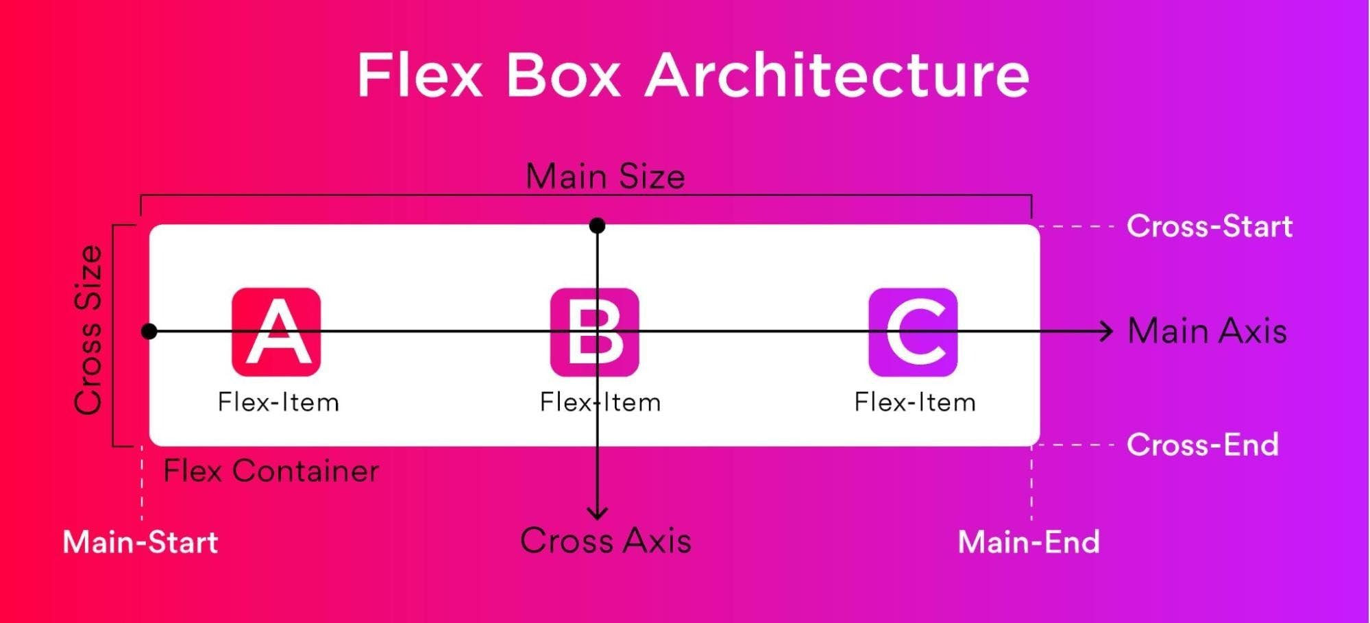
Flexbox architecture
The flex item is distributed along the main axis and the cross axis and the layout changes position between the rows and columns.
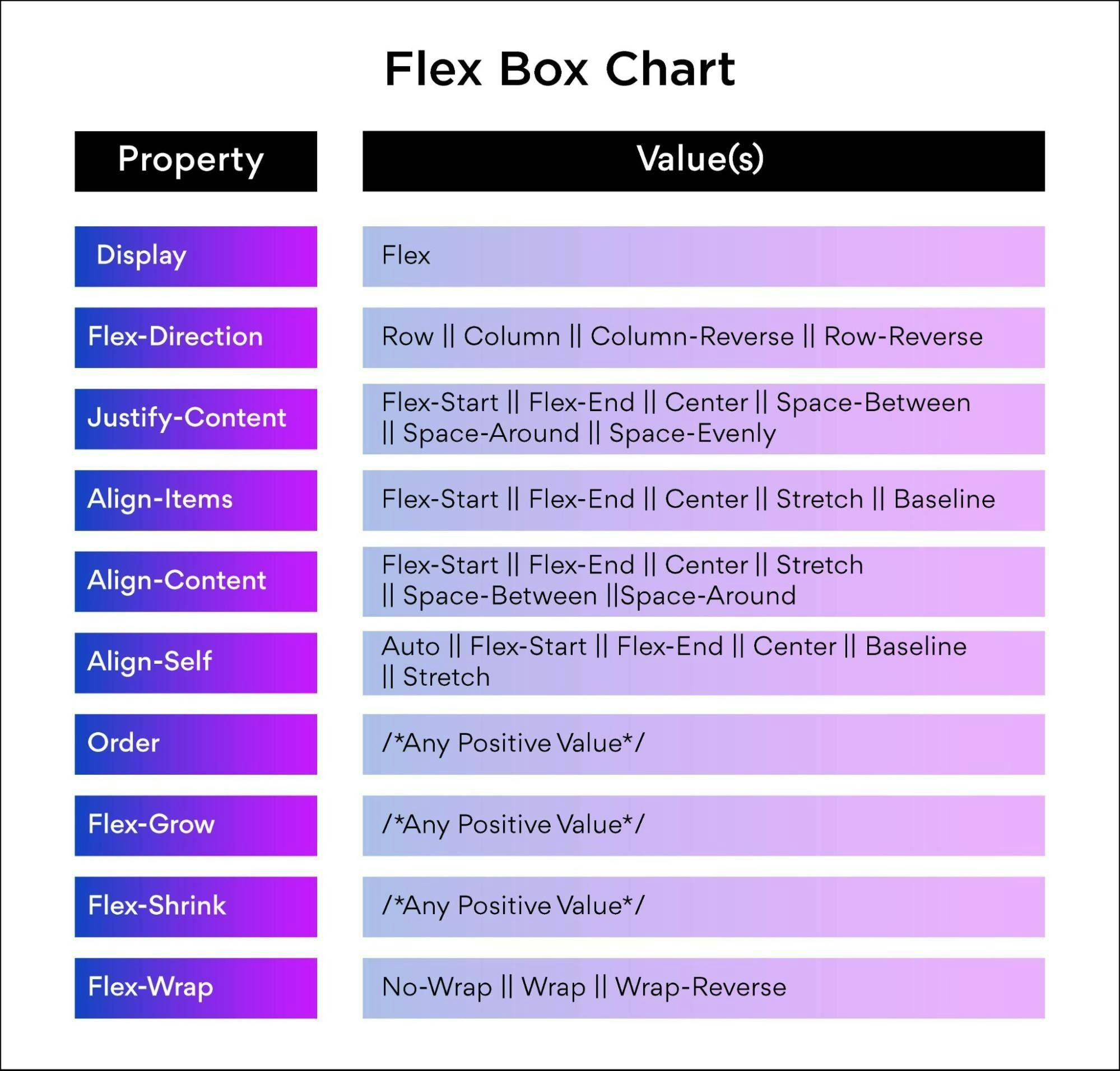
Flexbox charts
Flexbox charts contain all the properties and values that can be used in the process. You can refer to the following while executing a project or experimenting with different values.
Basics of flexbox
Here are the basic functions of flexbox:
- Display
- Direction
- Wrap
- Flow
- Justifying content
- Align items
- Align content
- Flex grow or shrink
- Flex basis
- Flex
- Align self
- Order
Let’s elaborate on flex grow or shrink function.
Flex grow
The flex grow property is defined by the ability of a flex item to grow. It accepts a unitless value that will serve to define the proportion. It helps in understanding the amount of space available inside the container that can be taken up by the items.
If the items are commanded to flex-grow to set 1, then the remaining space in the container will be distributed equally amongst the child items. When an element is not flexible, the flex-grow property will not have any effect on it.
Flex shrink
The flex shrink property tells how the items in the container will shrink. Similar to flex-grow, if the element is not flexible, the flex-shrink property will not have any effect.
How does flex grow or shrink help in building a smart layout?
Here is how you can use flex grow or shrink to build a smart layout:
Flex Grow:
Flex-grow is a CSS property that will set the flex-grow factor of a flex item’s main size. You can use the below syntax for the flex-grow property:
The flex-grow property will be specified as a single number. Using negative values is invalid and default values are at 0.
This property specifies how much of the remaining space in the flex container will be assigned to the item with the flex-grow factor. The main size is the proportion of the item that is dependent on the flex-direction value.
The remaining space is the flex container’s size minus the size of all the flex items together. When all sibling items have the same flex-grow factor, then all items will receive the same share of remaining space, else it will be distributed as per the ratio defined by the different flex-grow factors.
You can also use flex-grow along with other flex properties like flex-shrink and flex-basis. Flex-grow is normally defined using the flex shorthand for ensuring that all values are set.
Flex shrink
Flex-shrink is a CSS property that sets the flex shrink factor of a flex item. When the size of all the flex items is higher than the flex container, the items shrink to fit as per the flex-shrink property.
Flex-shrink can be used along with other properties like flex-basis and flex-grow. Just like flex grow, shrink is also defined using the flex shorthand. To use the flex-shrink property, use the below syntax:
The flex-shrink property is specified as a single number and the values can’t be negative as they will become invalid. Defaults should be 1.
Building a smart layout using flexbox
Setting up the project
Before coding, save some values into the variables and clear the default browser styles. Define some media query mixes to save time and avoid repetition of code.
SCSS
SCSS is a preprocess of CSS that gives more functionality than regular CSS. When nesting child classes inside a parent class, it is important to store the values into variables, and SCSS helps to save a lot of time.
If you use the codepen, you can do the following.
- Define the border color, padding values of the variables, and gap. Specify various screen breakpoints in the SCSS map. Remember that the keys and the pixels are the major values.
- To save the code and time, use the mixins and loop the breakpoints. You can now change the default styles of your browser by removing the margin and padding and setting up the box-sizing to the border-box.
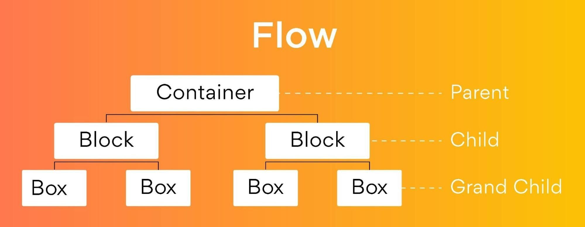
Let’s discuss the relationship between the HTML classes that are in use. Flexbox properties will define the container class work on the block. It is a property defined in the block class and the box class.
Here are three examples of layout creation that can help you understand flexbox better:
Building a card layout
HTML
The container class will hold three children → block1, block2, and block3. The block1 class will carry three boxes → box1, box2, and box3. The same rules will apply for the block2 and block3 classes, but the values will get changed.
SCSS
Now, style the container class as required. Trigger flexbox and access its power for the display: flex function. Select all the .block–* classes and style them together. At the same time, define the media query using the mixin that was created during the setup phase. Then, select all the .box-* classes and style them together using the code below:
Building a nav bar layout
HTML code
Remove all the HTML code from level1 and write the code below. The parent class1 has four child classes.
SCSS:
Some of the style rules for the container class of level 2 are below. Here, set up a media query with the help of the mixin.
Building a holy grail layout
HTML
The HTML ruler for the holy grail layout is similar to the nav bar with some minor changes as mentioned in the code below:
SCSS
First, change the container class styles with the code below:
Second, target and style all block-* classes together using this code:
Third, target and style all box-* classes together with the code below:
Fourth, target the boxes using the flex-basis for distribution of the screen space individually using the code mentioned below:
Finally, include the media query mixin for the mobile version of the code. Notice that we are hiding box-2 for the mobile version.
Be it the flexbox sizing, source-order independence, or simply the elements evolving around it, you can always find a way to deploy it using flexbox. The syntax and implementation of flexbox using the HTML code can help you make the most of the smart layout.
Most of the browsers now support flexbox in all its latest versions, though some of the older versions of browsers use different codes. These browsers no longer require prefixes to support the codes. You can use the tables for mapping the various syntaxes and get flex to support other incompatible browsers.
Layouts in CSS are getting powerful, and flexbox is one of the majorly used table-based layouts. Float-based layouts provide a compatible solution to flex. They are used to support relatively modern browsers and can help shape the tools to the finest level.
FAQ’s
1. What kind of layouts is flexbox best suited for?
The one-dimensional layout system is the best fit for flexbox and we can use it for creating a row or column exis layout. It will make our life easier for designing and building responsive web pages without getting to use tricky hacks and a lot of position and float properties in our CSS code.
2. Is Flexbox better than CSS grid?
CSS Grid and Flexbox are layout models which share the same similarities and can be used together. The major difference is CSS Grid is used for creating two-dimensional layouts whereas Flexbox is for one-dimensional layouts. It means you can place components along the X & Y axis in CSS Grid whereas in anyone in Flexbox. So, when you consider using it for a one-dimensional layout, then Flexbox is the best.
3. Is flexbox responsive?
Flexbox will make elements responsive which means the elements change their behavior as per the device displaying them. Also, it will make such elements flexible and will provide them with appropriate symmetry and position.
4. When should you not use flexbox?
You shouldn’t use flexbox under the below circumstances:
- Don’t use it for page layouts.
- Don’t use it for display: flex for every single container
- Don’t use it when you have more traffic
5. Can I use flexbox with bootstrap?
Yes, flexbox can be used with bootstrap 4. Bootstrap 4 uses flexbox instead of float. The flexbox layout module helps to create a smart and flexible design layout without using floats or positioning.