Hamburger_menu.svg

100 Bootstrap interview questions and answers in 2024

If you want to work as a successful Bootstrap developer for a top Silicon Valley firm or build a team of talented Bootstrap developers, you've come to the right spot. We've carefully compiled a list of Bootstrap developer interview questions for your Bootstrap interview to give you an idea of the kind of Bootstrap interview questions you can ask or be asked.

Last updated on Mar 27, 2024

Bootstrap is a free and open-source web development framework. With this framework developers can easily create responsive and mobile first websites and web applications. Here we have presented an exhaustive list of 100 Bootstrap interview questions and answers divided into beginner, intermediate and advanced levels.

Whether you are a developer looking for a job as a Bootstrap developer, these questions are an excellent resource to progress in web designing or front-end development careers. Besides, this guide can also serve the recruiters looking to hire the right talent for their project needs.

Basic Bootstrap interview questions and answers

1.

Tell me about Bootstrap?

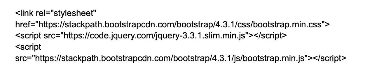
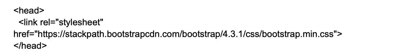
Bootstrap is a popular front-end CSS framework used for developing responsive and mobile-centric websites. It requires jQuery for proper functioning and is composed of three main files:

  • Bootstrap.js that is based on JavaScript
  • Bootstarp.css that is based on CSS framework
  • Glyphicons which is based on icon font set.

2.

List some features of Bootstrap?

Here are some key features of the Bootstrap framework:

Responsive Layouts: Bootstrap provides a responsive grid system which allows up to 12 columns per page, allowing developers to create layouts that adapt smoothly to different screen sizes.

Component Library: Bootstrap comes with a number of reusable components for navigation, pagination, alerts, and more, which reduces the time developers spend on styling and UI configuration.

Predefined CSS Styles: Bootstrap provides various predefined CSS styles which can be directly used to develop a web page. This includes styles for typography, forms, buttons, tables, modals, etc.

JavaScript Plugins: Bootstrap includes several jQuery plugins that can provide additional UI features like tooltips, modals, carousels, etc.

Customizability: Bootstrap allows developers to customize the framework according to their needs. They can choose just what they need from a range of features and functionalities.

Cross-Browser Compatibility: Bootstrap is compatible with all modern browsers, which ensures that the developed websites provide the same user experience across all platforms.

Documentation: Bootstrap provides thorough and easy-to-understand documentation, making it easier for developers to get started and understand how to use different components.

3.

Why should one use Bootstrap?

Some reasons that make Bootstrap popular for designing and development are:

Consistency: This CSS framework comprises the concept of paring that help ensure consistency.

Ease in use: Can easily be integrated with CSS and LESS files.

Speed: Ready made codes can be used instead of creating them from scratch.

Customization: Offers a high level of customization.

Community support: It being open source there is a large community support.

4.

List the components of Bootstrap?

Bootstrap is composed of 5 components,

CSS: Have several CSS files.

Scaffolding: Offers a structure with link styles, grids, and background.

Layout components: Offers a list of components.

JavaScript plugins: Includes jQuery and Javascript plugins.

Customize: Options for framework customizations.

5.

What do you know about the layout types of Bootstrap?

There are 2 layouts available in Bootstrap

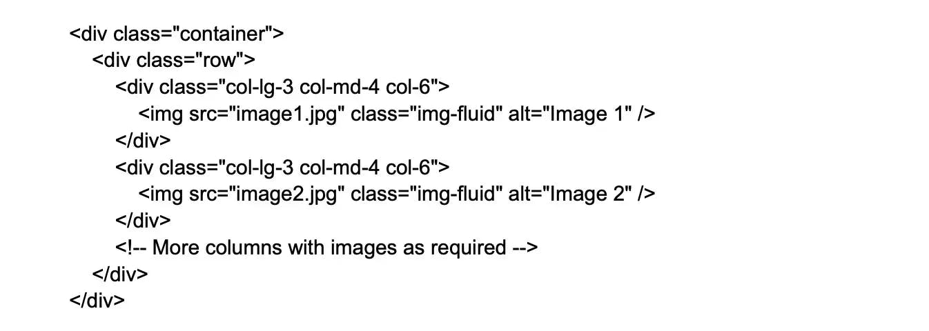
Fluid-Layout (.container fluid layout) - can measure units of block content and images.
Fixed-Layout ( .container layout)- facilitate fixed-width responsive container.

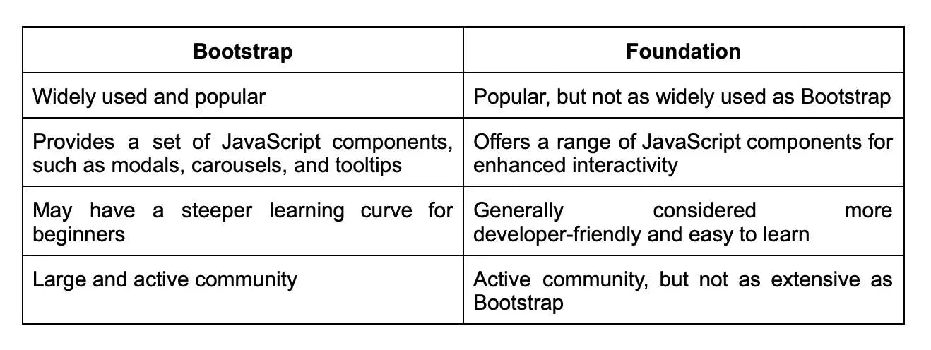
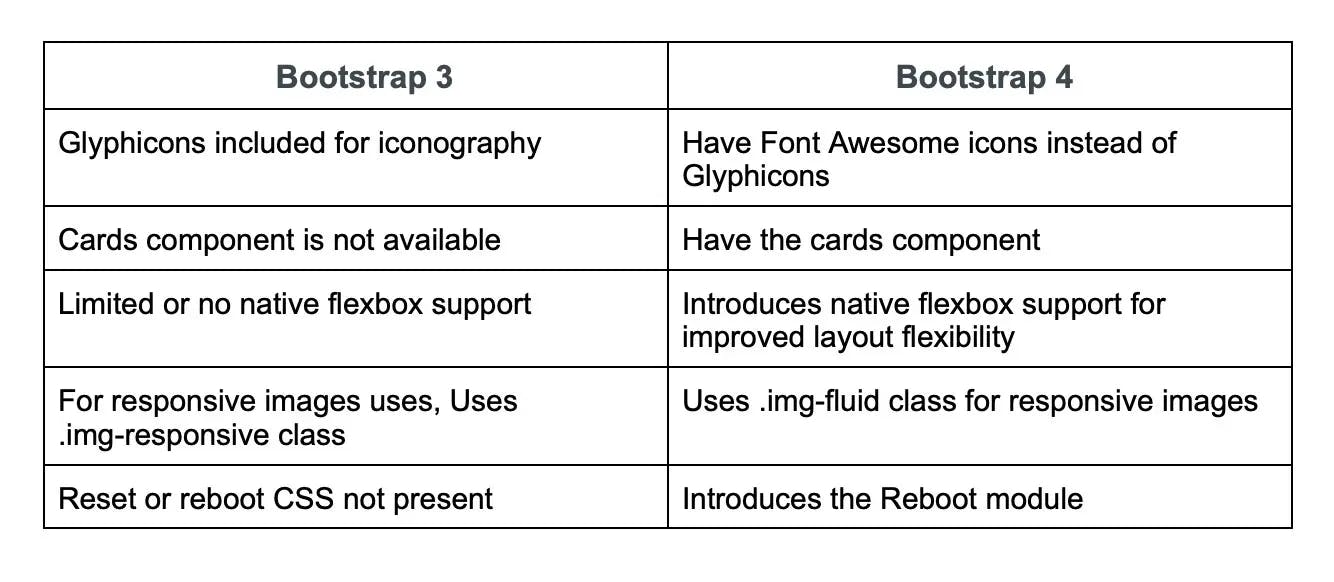
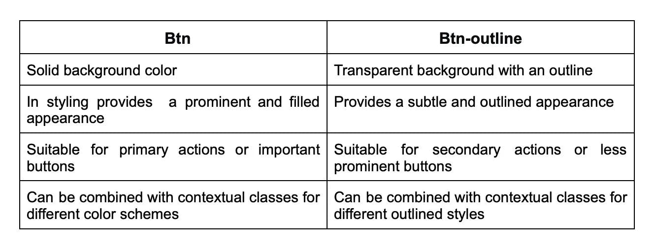
6.

Differentiate between Bootstrap and Foundation.

Bootstrap and Foundation can be compared as follows:

Image 17-07-23 at 8.46 PM.webp

7.

What do you know about offset columns in Bootstrap?

In Bootstrap, an offset is a blank column used to add more spacing between columns. The .col-md-offset-* classes can be used to add offsets on large displays, while the .offset-md-* classes can be used to move columns to the right. This is a useful feature for creating responsive and visually appealing layouts in Bootstrap.

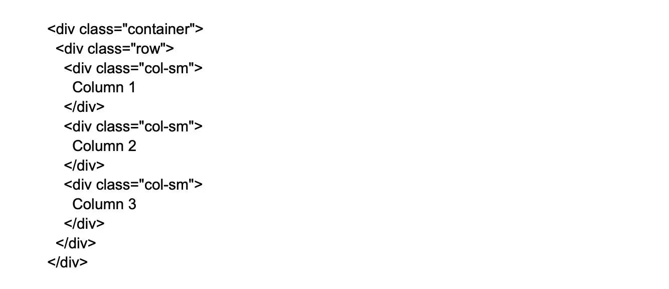
8.

What is Bootstrap grid system?

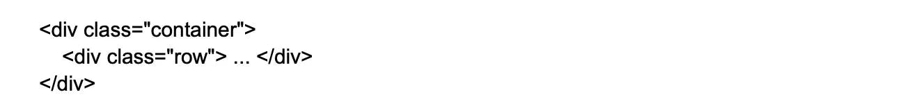
The Bootstrap grid system is a powerful and flexible layout system that allows developers to create responsive layouts of different sizes and shapes using a set of rows, containers, and columns. This system is fully responsive and is developed with flexbox, making it easy to create responsive designs that work on a range of devices. Overall, the content is concise, clear, and informative.

9.

In Bootstrap, what is the media object and what are their types?

Images, movies and audio can be positioned to the left or right of content blocks using Bootstrap's media objects. The class. media can be used to create media elements and the class. media-objects can be used to specify the source. Media objects can be divided into two categories:

  • .media
  • .media-list

10.

Why is Bootstrap chosen for website building?

There are certain reasons why Bootstrap is chosen for website building

Good grid system: Great grids offer a good page layout. And, Bootstrap offers mobile grid system which is responsive too.

Compatibility: Compatible with nearly all popular browsers and IE versions.

Documentation: Well compiled documentation and demos.

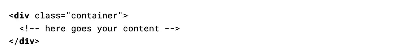
11.

What do you know about Bootstrap container?

Bootstrap containers play a crucial role in creating responsive layouts. They set the margins of the content on a page and contain row elements that serve as column containers. Overall, containers are an essential component of Bootstrap that helps to ensure consistent and responsive layouts.

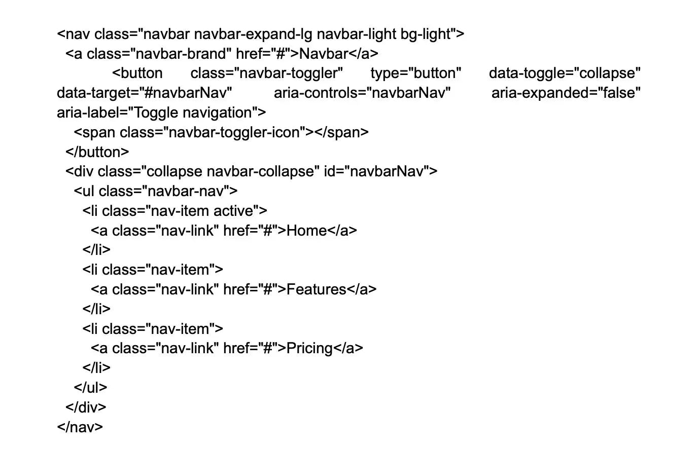
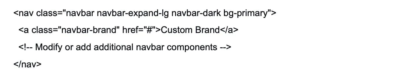
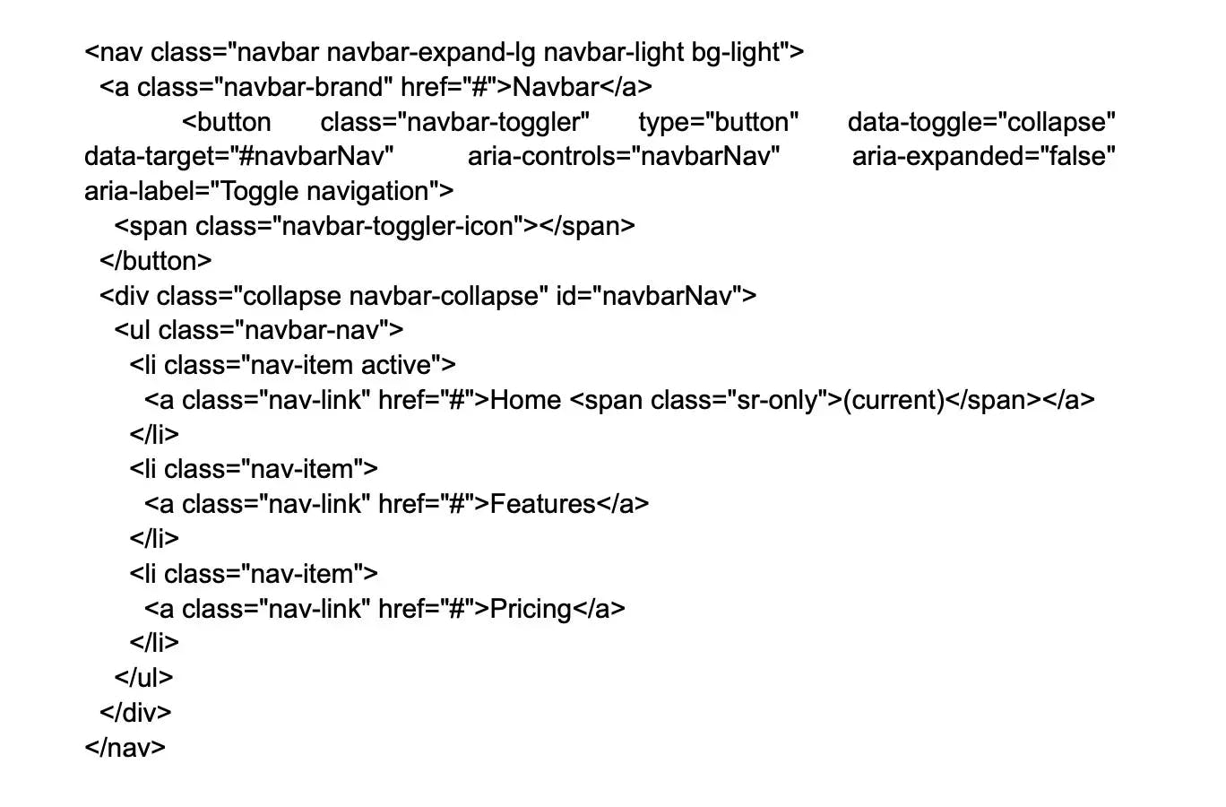
12.

What is Bootstrap navbar ?

The Bootstrap navbar is a powerful and flexible component that allows developers to create responsive and customizable navigation bars for websites and web applications. It includes various options for styling, positioning, and behavior, and can be easily customized using CSS and JavaScript. The navbar can include links, buttons, dropdown menus, and other interactive elements, making it a versatile and essential component for website navigation. Overall, the content is concise, clear, and informative.

13.

What are the chief components of Bootstrap?

You will often come across this Bootstrap interview question for experienced professionals. The key components of Bootstrap are:

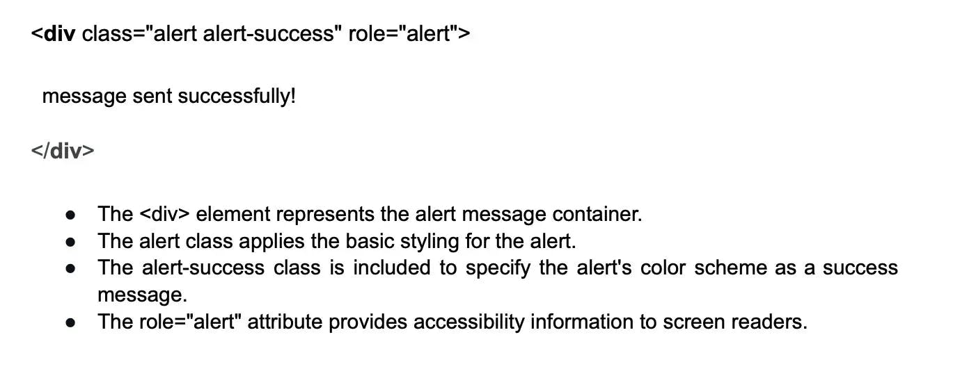
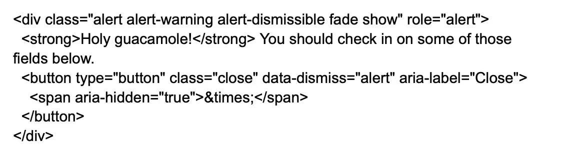
  • Jumbotron: It simply draws attention to a specific piece of content or information by making it larger and more visible.
  • Alerts: An alert is a popup that occurs after a specific action and displays a specified message.
  • Buttons: Customized buttons that are used to accomplish a certain action in a form, dialogue box, or other application. They are available in a variety of states, sizes, and styles.
  • Button group: A button group is a single line of buttons that can be positioned both vertically and horizontally.
  • Badge: A badge is a labeling component that is used to add extra information to a label.
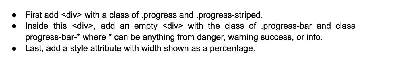
  • Progress Bar: A custom progress bar is used to illustrate the progress of a specific action. Text labels, stacked bars, and dynamic backgrounds are all included.

14.

What do you know about normalizing in Bootstrap?

Normalizing in Bootstrap refers to a technique that is used to reset or normalize the default styles of HTML elements across different web browsers. This technique ensures that web pages are displayed consistently across different browsers and platforms. By normalizing the styles of HTML elements, Bootstrap helps to eliminate inconsistencies and bugs that can arise from differences in browser rendering.

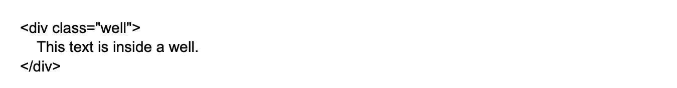
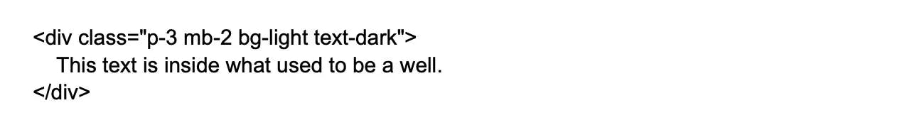
15.

Explain Bootstrap well.

This is an important Bootstrap interview question. The Bootstrap well is nothing more than a container that makes the content appear to be sunk. On the webpage, it can also create an inset effect. A developer can make a well and wrap the content in it with the help of div> and class. Your preferences will determine how the content is displayed.

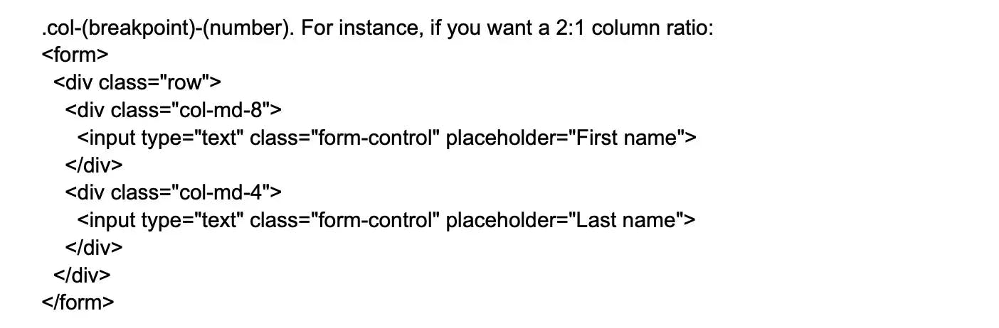
16.

What is column ordering in Bootstrap?

This is an important Bootstrap interview question. Column ordering is one of Bootstrap's most exciting features. Using relevant functions, the columns can be easily written in a certain order. You might also move them to a separate column. To simply swap or rearrange the order of the columns, use the push and pull column classes. The Bootstrap grid classes are col-xs-#,.col-sm-#,.col-md-#, and.col-lg-#. The push and pull classes for the Bootstrap grid are.col-xs-push-# and.col-xs-pull-#. This works great for sm, md, and lg sizes as well. Columns are moved to the left by the pull class, while they are moved to the right by the push class.

17.

What is the role of Bootstrap for mobile web development?

Certain reasons for which Bootstrap is crucial for mobile web development are:

  • It redesigns elements in a manner that supports flat design.
  • The mobile layout has dependency on percentage keeping mobile support in front.
  • Offers grid system for layouts

18.

Tell me about Class loaders in Bootstrap?

In Java, class loaders are responsible for loading Java classes into the Java Virtual Machine (JVM) at runtime. The JVM needs these classes to execute Java applications properly. There are three types of class loaders in Java: Bootstrap class loader, extension class loader, and system class loader. The Bootstrap class loader is responsible for loading core Java classes, while the extension and system class loaders load classes from external libraries and application classes, respectively. Overall, class loaders are an essential part of the Java platform and are used to ensure proper functioning of Java applications.

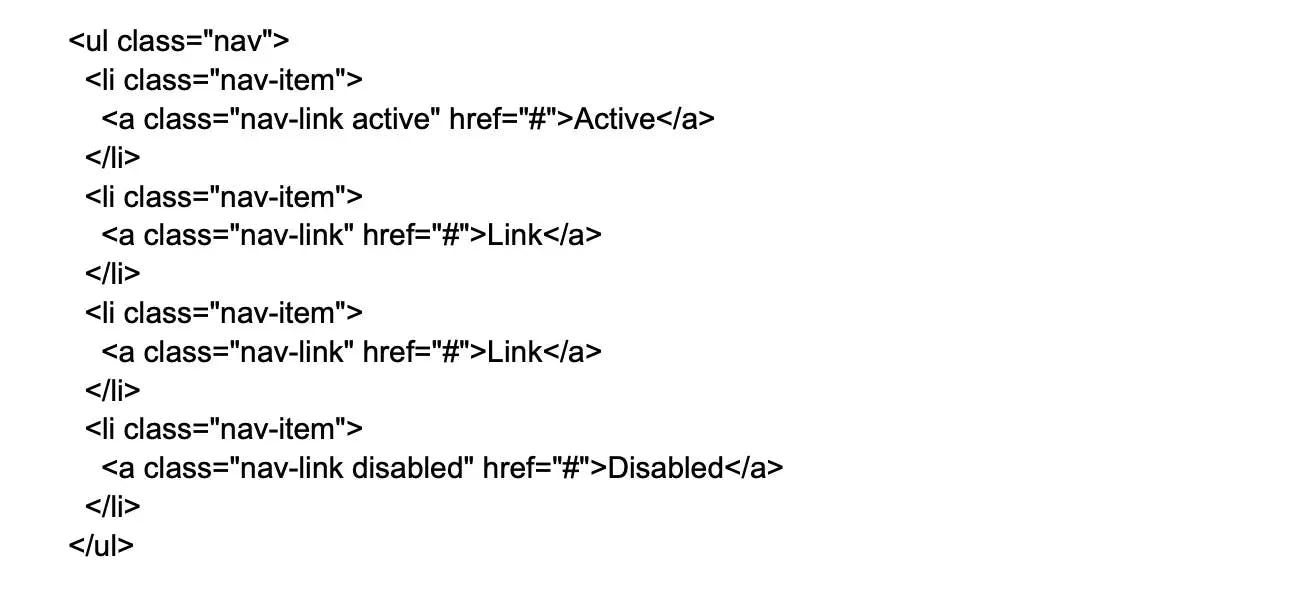
19.

Bootstrap supports 3 lists, what are they?

3 lists support by Bootstrap are as follows:

Active items: Active can be used to depict current selection

Disabled items: Disabled to make the list appear as disabled

Flush: Can eliminate borders and rounded corners

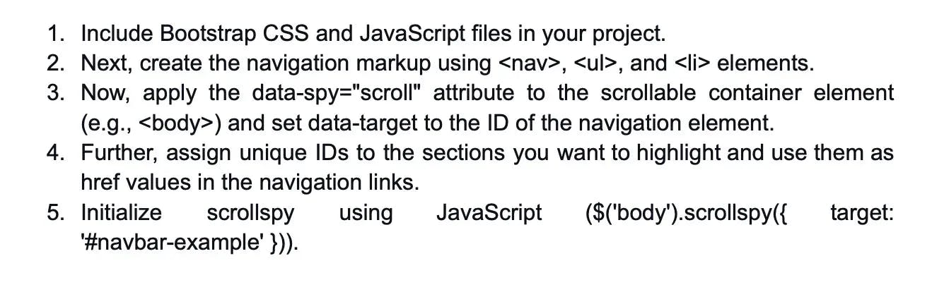
20.

What is Scrollspy Plugin in Bootstrap?

The Scrollspy Plugin in Bootstrap is a useful component for navigation elements. It works by automatically highlighting the navigation links that correspond to the current scroll position on the page. This allows the web user to know which portion of the page they are currently viewing and provides an easy way to navigate to different sections of the page. Overall, the Scrollspy Plugin is a powerful and versatile tool for creating responsive and user-friendly navigation in Bootstrap.

21.

What is Bootstrap breadcrumb?

The Bootstrap breadcrumb is a navigational component that helps to emphasize the current location of a web page within a hierarchy of pages. It does this by displaying a trail of links that represent the path to the current page. The breadcrumb component is customizable and can be styled using the Bootstrap CSS framework. Additionally, the component allows for the addition of separators between the links, further enhancing the visual hierarchy of the page. Overall, the Bootstrap breadcrumb is a useful tool for creating intuitive and user-friendly navigation in web applications.

22.

What is the use of affix Plugin in Bootstrap?

Affix Plugin locks the lament in a specific area of the page. The Plugin is mostly used for navigation menus and social icon buttons. This allows them to remain in a specific area when the user is scrolling up and down the page.

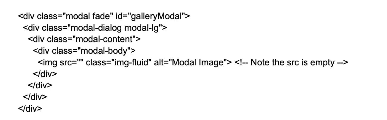
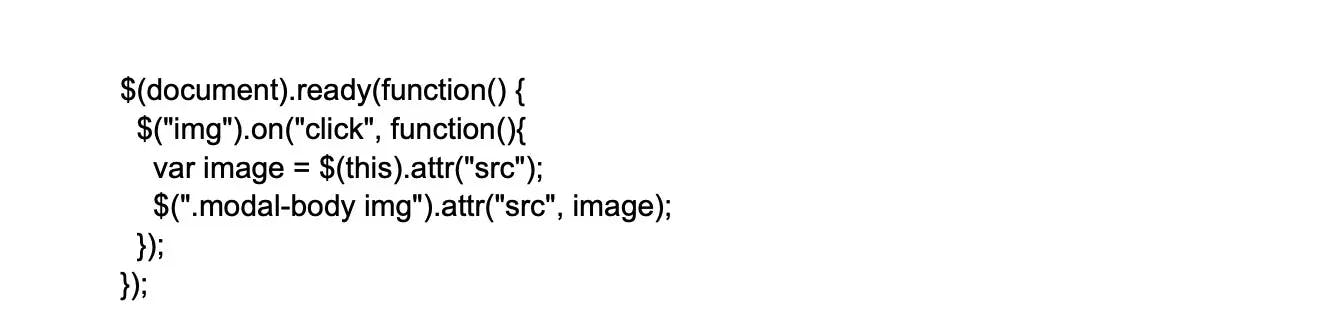
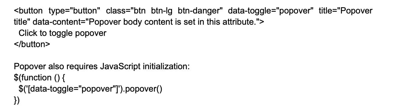
23.

What is the use of modal Plugin in Bootstrap?

The Modal plugin in Bootstrap is used to create and manage modal windows or dialog boxes. A modal is a user interface component that appears as a floating window on top of the main content, temporarily stopping user interaction with the rest of the page.
with the Modal plugin one can display important information, alerts, forms, or interactive content within a modal window. Here are some uses of the modal plugin:

  • To display alerts and notifications.
  • Modals have forms or input fields that allow users to give information or make selections within a modal window.
  • Can display additional information without the need for navigating away from the current page.
  • For displaying content from external sources.

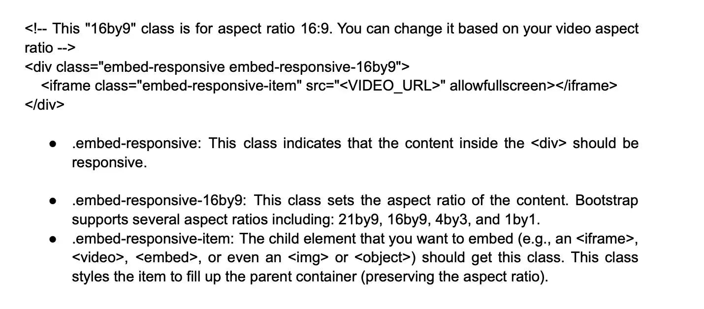
24.

What is the Bootstrap carousel plugin?

The Bootstrap carousel plugin is a component that allows developers to create image sliders or carousels in their web pages. The carousel can be used to display images, videos, content, or iframes in a sliding format. The carousel plugin is customizable and can be easily integrated into any web page using HTML, CSS, and JavaScript. Overall, the Bootstrap carousel plugin is a useful tool for creating dynamic and visually appealing content in web applications.

25.

Tell me about the Transition Plugin in Bootstrap?

The Bootstrap Transition Plugin is a component that aids in creating simple effects of transition, such as fading, sliding, or zooming. The plugin is a part of the Bootstrap JavaScript library and is used to add animation effects to different elements of a web page. To use the Transition Plugin, you will need to include the transition.js file along with other JavaScript files that are required for your web page. Overall, the Transition Plugin is a useful tool for creating dynamic and visually appealing content in web applications.

26.

What do you know about glyphicons in Bootstrap?

Glyphicons are icon fonts or pictograms mainly used in web projects. They serve as a custom font that has more than 260 glyphs. Glyphicons are used in buttons, texts, toolbars, etc. They are not free and hence need licensing. But their creator has made them available for free.

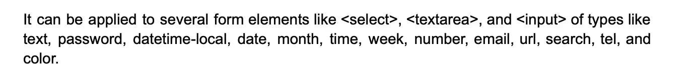
27.

What are Input groups in Bootstrap?

Input groups in Bootstrap are a useful component that can be used to enhance the functionality of input fields in forms. Input groups are similar to containers that can be used to add buttons, icons, or text to the input field. These elements can be used to provide additional functionality to the input field, such as a search button or an icon to indicate the type of input required. Input groups are customizable and can be easily integrated into any form using HTML and CSS. Overall, input groups are a useful tool for creating user-friendly and functional forms in web applications.

28.

How do you create and customize thumbnails in Bootstrap?

To create and customize thumbnails in Bootstrap, you can use the .thumbnail class within an < a > element. This class is used to display linked images in a grid format with a small markup. To customize the thumbnail, you can use CSS to change the size, border, padding, and other properties of the thumbnail.

29.

What is Jumbotron in Bootstrap?

It presents a big box that seeks to capture the attention of the visitors for some special information. It usually comes off as a grey box with round corners. Also, it can increase the size of the font of the text contained in the box. Any valid HTML classes can be inserted in it.

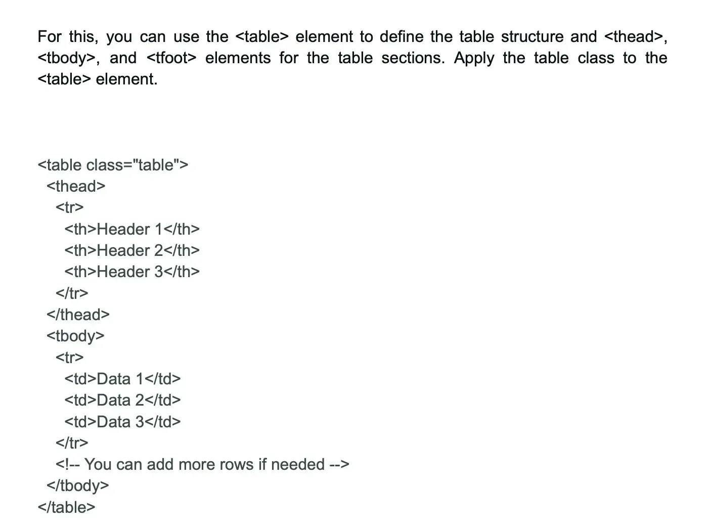
30.

How is code shown in Bootstrap?

Code can be shown in Bootstrap in following two ways:

Image 17-07-23 at 9.00 PM.webp

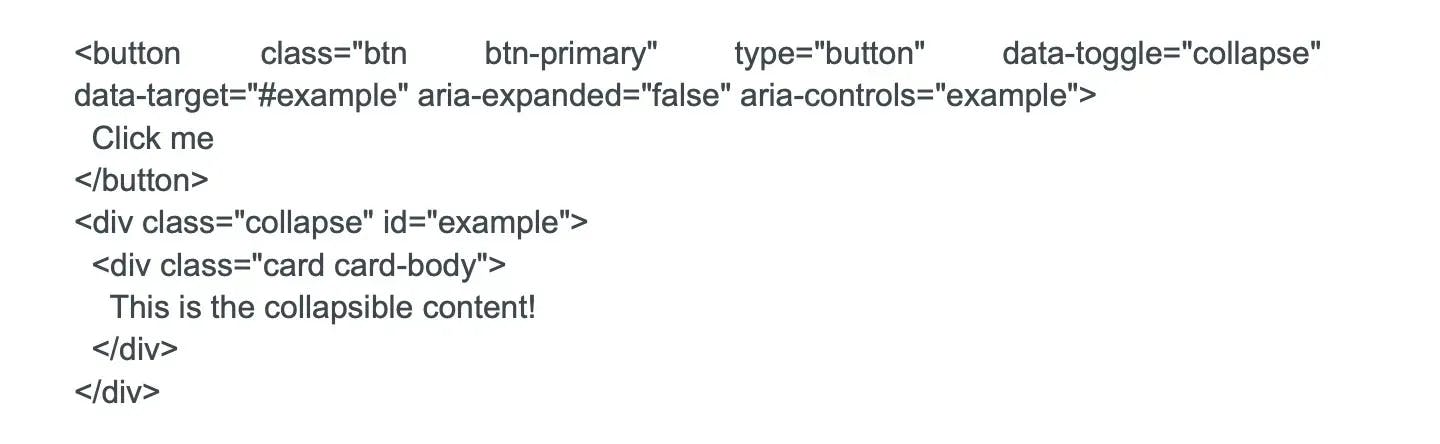
31.

What do you know about Bootstrap collapsing elements?

Bootstrap collapsing elements help conceal and show content. To achieve this, .collapse class is used that has a collapsible element.

  • To conceal the content, .collapse is used.
  • To depict the content .collapse .show is used.
  • And, at content transition time .collapsing is used.

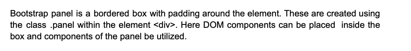
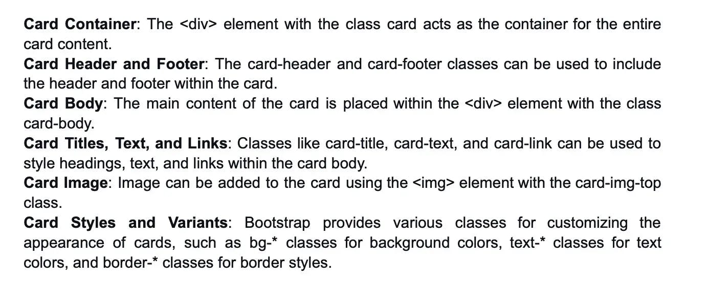
32.

Tell me about the Bootstrap panel?

Image 17-07-23 at 9.04 PM.webp

Tired of interviewing candidates to find the best developers?

Hire top vetted developers within 4 days.

Hire Now

Intermediate Bootstrap interview questions and answers

1.

What do you know about links and typography in Bootstrap?

Links are used to make HTML elements clickable whereas Typography is used for formatting and styling the content. Typography is used to create paragraphs, lists, inline elements and many other design-oriented styles of fonts.

2.

What are button groups in Bootstrap?

Button groups are very useful in the Bootstrap framework that allow developers to stack multiple buttons in a line together. Other than this, they can be used to place the alignment buttons together and optional JavaScript radio.

3.

What are Labels and badges in Bootstrap?

Bootstrap “.label” is a predefined class that gives more details related to links and text on the web page. This can include warnings, counts, updates, etc. Badges are components that serve to display an indicator or count a number. They are similar to labels except that they have more rounded corners.

4.

What is Bootstrap alert?

Bootstrap alert is a way to create predefined messages. This allows you to send messages to the user including contextual messages.

To create an alert , use the following steps:

Image 17-07-23 at 9.13 PM.webp

5.

What is the Bootstrap page header?

The Bootstrap page header is a component that is used to add appropriate spacing between headings on a web page. This feature helps to demarcate the more important headings from the less important ones by adding visual hierarchy to the page. The page header can be customized using CSS to change the font size, color, and other properties of the text. Additionally, the page header can be used to add a background color or image to the header, making it a versatile tool for creating visually appealing and organized layouts in web applications. Overall, the Bootstrap page header is a useful component for creating visually appealing and well-organized web pages.

6.

What is the process to create vertical forms in Bootstrap?

To create a vertical form in Bootstrap:

Image 17-07-23 at 9.19 PM.webp

7.

What do you know about pagination and its types?

Pagination informs about the presence of a series of interrelated contents across numerous pages. They are built using HTML elements with each page hyperlinked to another page.

There are two types of pagination-active and disabled.

Active pagination: This highlights the current page number making it easy for the user to know the page they are currently on. “.active” class is used here.

Disabled state pagination: This allows you to disable certain page links using “.disabled” option

8.

How can you make a striped progress bar in Bootstrap?

The steps to make a striped progress bar in Bootstrap are as follows:

Image 17-07-23 at 9.23 PM.webp

9.

List some contextual classes in Bootstrap?

In Bootstrap, contextual classes are used to provide "contextual feedback" for the users. These classes are mostly used with the components like Alerts or Badges to denote the type or category. These contextual classes can be used within a Bootstrap component to add meaning through colors. However, the syntax may vary slightly depending on the component. Bootstrap includes several predefined contextual classes:

.text-primary: For light blue colored text

.bg-primary: For light blue colored background

.text-secondary: For grey colored text

.text-danger: For red colored text

.text-warning: For orange colored text

.text-decoration-none: For removing the text decoration

.text-break: For breaking words to prevent overflow

10.

What are responsive utility classes?

Responsive utility classes in Bootstrap allow for showing or hiding elements based on the size of the user's viewport or device screen. These classes enable developers to create designs that are adaptable to different screen sizes, thereby ensuring that their website or web application looks good on all devices, from mobile phones to desktop computers.

Image 17-07-23 at 9.30 PM.webp

11.

What is lead body copy in Bootstrap?

The lead body copy in Bootstrap is a component that is used to highlight or emphasize a particular paragraph on a web page. It creates a large font size and adds light fonts or tall length lines to the text, making it stand out from the rest of the content. The lead body copy is commonly used for introductory paragraphs or important messages that need to be highlighted for the user. The lead class can be added to any paragraph element in Bootstrap to create the lead body copy effect. Overall, the lead body copy is a useful tool for creating visually appealing and attention-grabbing content in web applications.

12.

Can you make an image responsive in Bootstrap?

Yes, you can certainly make an image responsive in Bootstrap. Responsive images automatically adjust to fit the size of the screen or browser window.

Image 17-07-23 at 9.34 PM.webp

13.

How can you create a Pills navigation menu in Bootstrap?

Pills are a preferred navigation style as they improve user experience and navigation flow. To create a navigation menu, you will need to include the right Bootstrap classes and know what function those classes perform.
So, in order to create a pills navigation menu, add the class .nav-pills to the nav element along with .nav class. Here we use the .nav class as it is the base class for any navigation style in Bootstrap. Here .nav class element wraps .nav-link class element. Also, the .nav-link class should be given to all link elements available in the navbar.

14.

Differentiate between Bootstrap Grid system and other grid systems?

Bootstrap's grid system is among the most popular web layout systems used by developers, but there are many other grid systems like Foundation, CSS Grid Layout, Flexbox, and so on. Here's how Bootstrap's grid system differs from others:

Bootstrap Grid System:

  • Bootstrap uses a 12-column responsive grid system, allowing for different arrangements of content across different screen sizes.
  • It uses a straightforward and consistent class naming convention that includes the screen size, grid behavior, and the number of columns.
  • The Bootstrap grid system uses Flexbox in Bootstrap 4 (and later versions). It replaced the Floats grid system used in Bootstrap 3.
  • It even compensates for padding, margins, and nested rows and columns.
  • As part of a large library, it comes with many additional components and JavaScript plugins.

Foundation Grid System:

  • Like Bootstrap, Foundation also uses a 12-column grid system.
  • However, Foundation allows users to customize the grid system (number of columns, breakpoints, etc.) by modifying a settings file.
  • In addition to the basic grid, it includes separate grid layouts for small (mobile), medium (tablet), and large (desktop) screens.
  • It requires slightly more complex class naming and organization, which can be more difficult for beginners.

CSS Grid Layout:

  • CSS Grid Layout is a native CSS module, not a library, and offers a two-dimensional grid-based layout system.
  • CSS Grid provides more control over the layout and placement of elements, regardless of their HTML source order, enabling complex layouts.
  • It defines both rows and columns, unlike Bootstrap's column-based system.
  • It doesn't require additional classes as Bootstrap does. However, using it effectively requires a thorough understanding of CSS.

Flexbox:

  • Flexbox is also a native CSS module, designed for one-dimensional layouts.
  • It allows for responsive elements within a container to be automatically arranged based upon screen size.
  • Flexbox is simpler and more flexible than the traditional grid systems but might be less intuitive compared with the grid system in Bootstrap or Foundation.
  • The Bootstrap grid system uses Flexbox in Bootstrap 4 and later, inheriting much of its flexibility and responsiveness.

In conclusion, different contexts or project requirements may lead developers to favor one grid system over another. Bootstrap's grid is highly intuitive and easy to implement, especially for those already using Bootstrap. In contrast, native CSS modules like CSS Grid and Flexbox allow more control over placement and layout but require a deeper understanding of CSS.

15.

How can you achieve a responsive design using Bootstrap?

Achieving a responsive design in Bootstrap involves using a variety of features provided by the framework. Here's a step-by-step guide:

Include the Viewport Meta Tag: Bootstrap is designed and built mobile-first, a strategy in which we design for the smallest screen first and then add breakpoints for larger screens. To ensure proper rendering and touch zooming for all devices, add the viewport meta tag in your HTML file:

Image 17-07-23 at 10.38 PM.webp

Utilize Bootstrap’s Grid System: Bootstrap's grid system uses a series of containers, rows, and columns to layout and align content. The grid system is responsive and the columns will rearrange automatically depending on the screen size.

Image 17-07-23 at 10.39 PM.webp

Use Responsive classes: Bootstrap provides classes that can be added to make the specific elements responsive. This includes images or any other components. .img-fluid class is used for responsive images.

Image 17-07-23 at 10.41 PM.webp

Utilize Responsive Breakpoints: Bootstrap includes six default breakpoints, each responsive up to a certain screen size. They are xs, sm, md, lg, xl, and xxl, representing extra small to extra extra large devices. We can use these breakpoints to hide or show component in specific view sizes using d-* classes.

Image 17-07-23 at 10.44 PM.webp

Responsive Typography and Spacing: Responsive typography and spacing can be achieved using a set of utility classes provided by Bootstrap. For example, the .text-sm-left class will make the text left-aligned on devices that fall under the sm (small) breakpoint and above.

Navbar Component: For navigation components, Bootstrap provides a responsive, mobile-first navbar that automatically collapses at the lg (large) breakpoint.

Image 17-07-23 at 10.46 PM.webp

In this way, Bootstrap gives you the capability to easily make your design responsive using its grid system, responsive classes, and breakpoints.

16.

What can you do to add an image to your web page using Bootstrap?

We can add an image to a webpage using Bootstrap using the built-in img class.

Image 17-07-23 at 10.48 PM.webp

Here img tag adds the images to the web page, img-fluid makes the image responsive and resizes automatically, the alt attribute provides a description of the image.

17.

Explain Bootstrap's "container" class?

This class provides a fixed-width container for web page content. It ensures that your content remains within a certain width, irrespective of the screen size. Let’s see this through an example.

Image 17-07-23 at 10.49 PM.webp

Here the class container creates a container for your content. And, then the content can be added inside the div element. This class keeps the content centered and with padding on both sides.

18.

What is the process to create a button using Bootstrap?

We can create a button in Bootstrap using the built-in btn class. Let’s see how

Image 17-07-23 at 10.51 PM.webp

Here the button tag creates a button element. btn and btn-primary classes style it with color.

19.

What is the difference between "container" and "container-fluid" classes in Bootstrap?

The main difference between the "container" and "container-fluid" classes in Bootstrap is the width and padding of the container. The "container" class creates a container that has a fixed width and horizontal padding. This means that the content inside the container will be centered and have a maximum width based on the screen size.

The "container-fluid" class, on the other hand, creates a container that takes up the full width of the view with no horizontal padding. This means that the content inside the container will stretch to fill the entire width of the screen.

In summary, the "container" class is used to create a fixed-width container with horizontal padding, while the "container-fluid" class is used to create a full-width container with no horizontal padding. The choice of which class to use depends on the design requirements of the web page and the desired layout of the content.

20.

List some benefits of using Bootstrap?

Bootstrap offers a host of advantages, making it a popular choice among developers for front-end design and development. Here are some of the key benefits:

Responsive Design: Bootstrap ensures that your website is automatically adjustable to any screen size and resolution. This makes your website design responsive and mobile-friendly.

Consistency: Bootstrap ensures consistency across different platforms, and even among team members. It provides a centralized development code, each element of which has been meticulously curated by the Bootstrap team.

Customizable: Developers have flexibility to choose the features that are required, resulting in a lightweight and efficient code. With its Sass variables and mixins, developers can customize the Bootstrap’s components, grid system, typography, colors, button sizes and much more.

Extensive List of Components: Bootstrap contains numerous ready-to-use components which can enhance your development process such as navigation bars, dropdown menus, modals, carousels, tooltips, and many more.

Strong Grid System: Bootstrap incorporates a powerful 12-column responsive grid system, which assists developers in organizing the layout of pages and makes it easy to create complex and flexible layouts.

Compatibility: Bootstrap is compatible with all major browsers like Chrome, Firefox, Internet Explorer, Safari and Opera. Therefore, it ensures that your website or application will render effectively across various browsers.

21.

Explain Bootstrap's "row" class in the Grid system?

In Bootstrap's Grid system, the .row class serves as a wrapper for columns. It's a key part of the grid system structure, which fundamentally consists of containers, rows and columns.

Bootstrap row class creates a horizontal row of columns in the grid system. It provides a horizontal layout and makes column using col class in Bootstrap grid system. This class can be used on webpage to make an attractive web application.

22.

What are Bootstrap's typography classes?

Bootstrap provides a set of typography classes grouped into several categories which allow you to manipulate your text style in terms of headings, alignment, transformation, color, weight, display headings, and more. Such as:

display-1: For large, bold heading.

lead: For making text stand out.

text-muted: To make the text look as less as important.

text-primary: Makes text appear in your theme’s primary color.

23.

How do you add an icon to your web page using Bootstrap?

To add an icon to your webpage, i element and icon classes can be used.

Image 17-07-23 at 10.59 PM.webp

Here i element adds the icon and bi bi-cart class informs which icon to use.

24.

How does Bootstrap ensure cross-browser compatibility?

Bootstrap ensures cross-browser compatibility through CSS and JavaScript that work successfully across varied browsers and versions. Besides, it holds browser specific css and Javascript files like HTML5 shim and Respond.js which makes sure that the features of Bootstrap work correctly on all browsers.

25.

How can you create a responsive layout using Bootstrap?

To create a responsive layout, one can use the grid system in Bootstrap with its responsive classes. The grid system that has rows and columns allow to define width of each column with “col-:” classes. Besides this, some other responsive classes like "col-sm-", "col-md-", "col-lg-", and "col-xl-" can be used to provide different column widths for different screen sizes.

26.

In Bootstrap, how can you add a footer to a web page?

For that, you can use the footer lament and the Bootstrap fixed-bottom class. Let’s see this through an example:

Image 17-07-23 at 11.04 PM.webp

Here the footer element holds a container div with some text inside it. Fixed-bottom ensures that the footer stays at the bottom of the screen and the bg-light gives the footer its color.

27.

Tell me about Bootstrap's "col" class in the Grid system.

In the Bootstrap grid system, the .col class is crucial for defining columns within a .row. The grid is a 12-column layout, so all the columns within a row should add up to 12 for full width coverage under a certain size. The columns are responsive, and will automatically adjust their width and position based on the screen size.

It can be used in combination with other classes such as col-sm, col-md, col-lg, and col-xl to make the size of the columns suitable for different screen sizes.

28.

How can you add a dropdown button using Bootstrap?

Load the Bootstrap Framework: Start by adding the Bootstrap CSS and JS files to your HTML file.

Structure the Dropdown Button: Bootstrap dropdowns are comprised of a toggle button and a dropdown menu enclosed in a parent div with the dropdown class. The button uses the dropdown-toggle class and a data-toggle="dropdown" attribute to indicate that it's tied to a dropdown menu.

Image 17-07-23 at 11.11 PM.webp

Create Menu Items: Each menu item should be wrapped inside a block-level html element with the dropdown-item class, such as a or button. The parent container of the menu items takes the dropdown-menu class.

29.

Give an example of a Bootstrap alert message?

To use an alert, add the class to a div element and add your text message.

Image 17-07-23 at 11.15 PM.webp

30.

What is the use of Bootstrap's "badge" component?

The Bootstrap's badge component is typically used to create small count indicators and labels. Badges can be used to highlight specific items, denote a status, or catch attention with a small identifier. Here are some examples of common uses:

Highlight New or Unread Items: A "New" badge can be added to menu items, listings, or graphical elements on a web page to draw attention.

Notification Count or Indicator: In navigation bars, badges are often used to indicate the number of unread notifications, messages, or updates.

Status Identifier: Changes in status, like "Success", "Danger", "Warning", "Info" can be highlighted using badges with contextual color classes.

31.

Tell me about the process to create a responsive image gallery using Bootstrap?

Creating a responsive image gallery using Bootstrap can be a straightforward process thanks to its grid system. Here's a simple step-by-step process for creating one:

Add Bootstrap CSS and JS Links: Include the Bootstrap CSS and JS links in the header of your HTML file:

Image 17-07-23 at 11.21 PM.webp

Create a Bootstrap Container: You start by creating a Bootstrap container which may either be a .container or .container-fluid depending on your design requirements:

Image 17-07-23 at 11.21 PM (1).webp

Create a Row: Inside the container, you create a .row:

Image 17-07-23 at 11.21 PM (2).webp

Create Columns with Images: Inside the .row, create as many .col-* as required based on the number of images and number of images per row. Inside each column, add your img tag and apply .img-fluid to make each image responsive. Assuming you want to display 4 images per row:

Image 17-07-23 at 11.21 PM (3).webp

In this example, col-lg-3 means that on a large screen (lg) and up, each column will take up 3 of the 12 columns in Bootstrap's grid system, i.e., 4 images per row. col-md-4 means 3 images per row on medium (md) screens, and col-6 means 2 images per row on small (sm) screens. You can adjust these settings according to your specific requirements.

Make sure to replace "image1.jpg" and "image2.jpg" with the actual paths to your images. The alt attribute provides alternative text for users who may not be able to view the image. Also remember, Bootstrap's responsive grid system will automatically stack the columns vertically on smaller devices.

32.

Differentiate between Bootstrap 3 and Bootstrap 4?

Bootstrap 4 is the latest version of Bootstrap and comes with several better features than Bootstrap 3. Some main changes include the addition of responsive grid tier, new class naming convention, new components, discontinuation of some classes and components, and a switch to a new default font.

Image 17-07-23 at 11.27 PM.webp

Tired of interviewing candidates to find the best developers?

Hire top vetted developers within 4 days.

Hire Now

Advanced Bootstrap interview questions and answers

1.

How can you customize Bootstrap for your project's needs?

Download Source Files: Visit the Bootstrap website (getBootstrap.com). here you can download the source files for the version you want to customize.

Customize Variables: Locate the "_variables.scss" file in the downloaded source files and modify the variables as per your requirements.

For example, you can change the primary color:

Image 18-07-23 at 1.13 PM.webp

Compile SASS: you will need the SASS compiler to compile the SASS code. Here's an example using the node-sass package:

Image 18-07-23 at 1.13 PM (1).webp

Include Customized CSS: In your HTML file, link the customized CSS file after the Bootstrap CSS file:

Image 18-07-23 at 1.13 PM (2).webp

Modify HTML Markup: Alter the HTML markup as needed to customize Bootstrap components. Here's an example of modifying the navbar component:

Image 18-07-23 at 1.14 PM.webp

2.

What is the "form-control" class in form elements?

The .form-control class in Bootstrap is used to provide universal styling to form elements. This class includes base CSS to style your form elements, which ensures consistent styling across various types of form fields. When you apply the .form-control class to form elements, it affects the appearance and layout of these elements by adding:

  • Block level display, taking up the full width of the parent element.
  • Standard heights and font styling.
  • Padding around the input.
  • Background color and border styling.
  • Default and focus states' appearances.

Image 18-07-23 at 1.18 PM.webp

3.

Explain Bootstrap's "carousel" feature for creating an image slideshow?

Bootstrap's "Carousel" is a component to create a responsive sliding or fading images slideshow, which involves a process of automatically or manually cycling (sliding or fading) through a series of items, which can be images or content, with the support for previous/next controls and indicators.

4.

Explain Bootstrap's utility classes?

Bootstrap's utility classes are a set of pre-defined classes that can be used to apply styles to elements without needing to write custom CSS. These classes can be added directly to HTML elements, making it easy to apply styles and customize the appearance of web pages.
Bootstrap's utility classes include classes for typography, spacing, colors, borders, and more. Here are some examples of Bootstrap's utility classes:

  • Text alignment: Classes like "text-left", "text-center", and "text-right" can be used to align text within a container.
  • Margin and padding: Classes like "m-3" and "p-5" can be used to add margin and padding to elements. The number after the "m-" or "p-" prefix determines the amount of margin or padding to add.
  • Background color: Classes like "bg-primary" and "bg-danger" can be used to add background colors to elements.
  • Border: Classes like "border", "border-top", and "border-danger" can be used to add borders to elements.

Using Bootstrap's utility classes can save time and effort in web development by providing a quick and easy way to apply styles to elements. However, it's important to use them judiciously and avoid overusing them, as they can make the HTML code more complex and difficult to maintain over time.

5.

Differentiate between "btn" and "btn-outline" classes in Bootstrap?

“btn’ class styles a button with a solid color background while “btn-outline” style a button with transparent background and an outline.

Image 18-07-23 at 1.22 PM.webp

6.

What is the process to create a responsive table using Bootstrap?

To create a responsive table, you can use div with table-responsive class to warp the table. This ensures that the table can be scrolled horizontally on small screens.

Include Bootstrap: First, you need to include Bootstrap CSS and JavaScript files in your project. You can either download the files and link them in your HTML file or use a CDN.

Create Table Markup: Start by creating the HTML markup for your table

Image 18-07-23 at 1.27 PM.webp

Add Responsive Class: Now, to make the table responsive, use the following code. This class adds horizontal scroll support for smaller screens.

Image 18-07-23 at 1.28 PM.webp

7.

Explain Bootstrap's "card" component?

Bootstrap card component is a flexible content container. It helps developers to display content in a visually pleasing and uniform manner along with support for different layout options.

Bootstrap's "card" component is a versatile and flexible container that is used to display various types of content in a visually appealing and organized manner.
It provides a consistent structure and styling for creating cards, which can be used to display different types of information, such as articles, products, user profiles, or any other content you want to present.
The Bootstrap "card" component holds multiple elements and classes that help in creating a well-structured and visually appealing card layout. Some features of the "card" component are as follows:

Image 18-07-23 at 1.31 PM.webp

8.

Tell me about Bootstrap's "sr-only" class in accessibility?

The “sr-only” class in Bootstrap is used to hide the content but accessible to screen readers. For this a CSS property "position: absolute" and "left: -10000px" moves the content off-screen while still showing it up in the document flow.

9.

Explain Bootstrap's "tooltip" feature for adding tooltips to elements?

In Bootstrap, a tooltip is a small pop-up box that appears when the user moves the mouse pointer over an element. It is used to provide extra information about something when a user hovers over it.

In order to use Bootstrap's tooltip feature, you'll need to include jQuery and Popper.js as tooltips are built with third-party libraries. It is also important to include Bootstrap’s JavaScript or it won't work.

10.

List some advantages of Bootstrap's "Sass" version?

Some benefits of Bootstrap “Sass” version are as follows:

Easy customization: Bootstrap variables can easily be changed without altering the original source code.

Small file size: Sass removes useless code making file size small and increase load time.

Modular: Makes it easy to manage large CSS files.

Mixins and functions: Simplifies complex CSS.

11.

What is the process to create customized form layout using Bootstrap?

To create a customized form layout using Bootstrap, use the following steps

Image 18-07-23 at 1.40 PM.webp

12.

How can you use Bootstrap's "input-group" component to create input groups?

“input-group” component allows the user to join the input field with different elements such as texts, buttons and dropdowns. To create these input groups, the “ input-group” class can be used in combination with other classes such as "input-group-prepend" and "input-group-append".

13.

How can you use Bootstrap's "tooltips" and "popovers" at the same time?

To use tooltips and popovers together, you need to add a data-toggle attribute with the value of “tooltip” or “popover” to the element for which you want to achieve this. Next add the data-content attribute for the content that you want to showcase in tooltip or popover. Last, for providing the title to tooltip or popover, add the title attribute to the element.

14.

What is the process to create a responsive video gallery using Bootstrap?

Creating a responsive video gallery with Bootstrap involves using the grid system, the embed component, and optionally, the card component for additional styling.

Here's a step-by-step guide on how you can create this:

Setup Bootstrap: Before you start, ensure that Bootstrap CSS and JS are properly linked in your HTML file. If you're using a local downloaded version, ensure all the necessary files are linked.

Image 18-07-23 at 1.48 PM.webp

Create the Gallery Layout: With Bootstrap, you can structure your video gallery using the grid system and cards. Here's a simple layout for a gallery with three videos per row:

Image 18-07-23 at 1.48 PM-2.webp

col-lg-4 col-md-6 causes the layout to display three cards per row on large screens (lg), and two per row on medium screens (md).

Add the Videos: To make a video responsive, Bootstrap provides the .embed-responsive and .embed-responsive-item classes.
Here's how you would add videos to each of these placeholders:

Image 18-07-23 at 1.49 PM.webp

In this example, .embed-responsive-16by9 is used for an aspect ratio of 16:9, commonly used for YouTube videos. The src attribute in the iframe should point to your video URL. Repeat this for as many videos as needed.

15.

Tell me about Bootstrap's "scrollspy" feature to create a table of contents?

Bootstrap's Scrollspy is a navigation mechanism that automatically updates navigation targets based on scroll position. In other words, as you scroll down the page, the navigation updates to highlight the appropriate link that corresponds to the current viewport. This feature can be particularly useful for creating a table of contents or a "jump-to" navigation within a webpage.

16.

Tell me about Bootstrap's "list-group" component.

Bootstrap's "list-group" component is a flexible and powerful component for displaying lists of elements. It is often used for creating menus, making selections, or creating other types of list-based user interface components.

Classic elements contained in a list group are typically sequential, as you would expect in a list, but with Bootstrap's "list-group" component, you can transform the elements based on different contexts using contextual classes or badges.

A basic example of a list group in Bootstrap is as follows:

Image 18-07-23 at 1.59 PM.webp

17.

Explain about the customization of Bootstrap's JavaScript components?

By customizing Bootstrap's JavaScript components, you can adapt them to your specific requirements, modify their functionality, and enhance the user experience. Thereby you gain the flexibility and control over how the components interact and appear in your web application or website. To customize a specific component, refer to the Bootstrap documentation for that component to understand its available options and how to initialize and modify its behavior

18.

Tell me about the use of Bootstrap's "media queries" in responsive design?

Bootstrap's media queries are an essential tool for creating responsive designs that adjust based on the screen size. By defining media queries using CSS, developers can customize the styles of elements for specific screen sizes.

Lets see this through an example

Image 18-07-23 at 2.01 PM.webp

Here, the font size of the element for class “exam” will be 20 pixe;s when the viewport is 778 pixels or greater.

19.

What do you know about Bootstrap's "flexbox" utilities?

Bootstrap “flexbox” utilities provide a set of CSS classes that manage the layout and alignment of elements through the Flexbox layout model. These classes help create flexible and responsive layouts with their minimal CSS code.

20.

What is the process to create a multi-column form layout using Bootstrap?

Creating a multi-column form layout in Bootstrap is straightforward and convenient due to its responsive grid system. Here's how to do it:

Step 1: Start the Form Start by creating a form tag:

Image 18-07-23 at 3.10 PM.webp

Step 2: Use the Grid System

To create a multi-column form, you will need to leverage Bootstrap's grid system inside the form element. A row is created using .row and columns are created using .col, .col-(breakpoint), or .col-(breakpoint)-(number) classes within the row.

Below is an example of a simple two-column form layout:

Image 18-07-23 at 3.10 PM (1).webp

In this example, the form is divided into two equal columns by using two .col classes. Each column contains an input field.

Step 3: Adjust Column Widths

To adjust the width of the columns, you can assign different grid values to

Image 18-07-23 at 3.11 PM.webp

In this case, on medium (md) screen sizes and larger, the first column will take up 8 of the grid's 12 columns, and the second column will take the remaining 4 columns, leading to a 2:1 column ratio.

Step 4: Add More Form Controls

You can include more form controls like checkboxes, radio buttons, selects, etc., into your form. Just ensure each control or group of controls is appropriately wrapped in a column division.

Bootstrap's grid system adapts to screen size. So on smaller screens, these two columns would stack on top of one another, ensuring your form remains functional and attractive on all screen sizes.

21.

How can you use Bootstrap's "scrollspy" feature to highlight navigation links?

To add “scrollspy” feature to navigation links, you will need to use "data-spy" and "data-target" attributes. You can add them to the navigation element. And, add the “id” attribute to the portion where you want to add the link to.

To use the Bootstrap's scrollspy feature to highlight navigation links based on scroll position , here are the steps to follow:

Image 18-07-23 at 3.14 PM.webp

22.

How do you create a responsive video using Bootstrap?

To create a responsive video in Bootstrap, you can use Bootstrap's embed-responsive class. This class allows the video to automatically fit the width of its parent container while preserving the aspect ratio. Here's how you can do it:

Image 18-07-23 at 3.19 PM.webp

23.

How do you create a custom theme for Bootstrap?

To create a custom theme, you will need to override the fault variable with new values and use a tool like Sass to compile CSS.
Let's take an example, where you want to change the primary color to blue.

  • Create a Sass file.
  • Now add new custom variable values.
  • Next, import the Bootstrap Sass files and custom variable files in th new Saa=ss file created above.
  • Finally, compile the Saa file to CSS.

24.

How can you use Bootstrap's "popover" feature to create popovers?

  • First add the data-toggle="popover" attribute to the element that will trigger popover.
  • Next, set the popover content through the data-content attribute.
  • Now use the popover() method to initialize the popover with JavaScript.

25.

Explain the use of Bootstrap's "offcanvas" component to create a sidebar navigation menu?

To create a sidebar navigation menu using Bootstrap” offcanvas” use the following steps.

  • Add HTML markup for the navigation menu.
  • Add a button to trigger the offcanvas.
  • Add necessary JavaScript files
  • Style the offcanvas and add media queries.

26.

Explain the process of using Bootstrap's "typeahead" feature to create an autocomplete search box?

To use this feature, you will need to include Bootstrap and jQuery libraries, and the "typeahead.js" file. Following which you can apply “typehead” function for an input field and mention the data source for autocomplete suggestions.

To create an autocomplete search box using Bootstrap's "typeahead" feature, here's what you can do

Include Required Files: Include Bootstrap CSS, JavaScript, and jQuery files in your project. This you can achieve by downloading them or linking them in your HTML file or by using CDNs.

Create HTML Markup: Here you set up the HTML markup for your search box.

Image 18-07-23 at 4.44 PM.webp

Initialize Typeahead: For Initializing the typeahead feature use JavaScript. Write a JavaScript code block to configure and initialize the typeahead plugin. And, to enable autocomplete functionality use typeahead() method on the search box element

Image 18-07-23 at 4.44 PM (1).webp

Define Autocomplete Options: In the JavaScript code, provide the autocomplete options by including an array of values for the source property.

Customize Typeahead: In order to customize the typeahead behavior and appearance further you can add additional options and event handlers in the JavaScript code.

27.

Explain Bootstrap's "collapse" feature?

Bootstrap's "Collapse" feature allows you to showcase or hide specific areas or components of your webpage, such as dropdown menus, accordion text sections, or navigation bars. It is developed using JavaScript and provides a smooth experience of showing and hiding content on different screen sizes.

Here's an example of how you can utilize Bootstrap's collapse:

Image 18-07-23 at 4.47 PM.webp

In this code:

  • A button is created with data attributes: data-toggle="collapse" and data-target="#example". These data attributes are linking this button to the collapse element.
  • The data-toggle="collapse" attribute enables the collapse functionality.
  • The data-target="#example" attribute connects the button to a specific collapsible element by id. In this case, it points to the id="example" div.
  • Upon clicking the button, the content inside the div with id="example" will be shown or hidden. The collapsible content could be a navigation area, an accordion section, or any detail to be shown or hidden upon button click.

28.

How can you use Bootstrap's "pagination" component to create pagination links?

Bootstrap pagination component can be used by including the required CSS and JavaScript files. Next, you need to form an unordered list with the class “pagination”. Now for each page link add list items. Lastly, use the required classes for styling the pagination and adding functionalities with JavaScript.

29.

Tell me some advantages of Bootstrap's "JIT" version?

Some advantages of Bootstrap JIT version are as follows:

Reduced File Size: The biggest advantage of using Bootstrap's JIT version is the significant reduction in the CSS file size. It only includes styles for the components that are used in your project, therefore eliminating any unnecessary bloat.

Faster Loading Time: Smaller file size leads to faster loading time of the website, which in return improves the web page performance and user experience.

Customization: Bootstrap's JIT version provides a better scope for customization. You can modify Bootstrap's default settings and only the necessary styles would be included in your CSS file.

Cleaner Codebase: The JIT version helps maintain a cleaner and more efficient codebase, as it eliminates styles for unused Bootstrap components.

Improved Performance: Optimized CSS reduces network traffic and gives an overall performance improvement. It's beneficial when considering metrics for site speed and SEO rankings.

30.

How to use Bootstrap’s "affix" feature for creating a fixed navigation bar?

While in Bootstrap 4 this feature has been removed, you can use it through CSS “position: fixed” property. The affix plugin was used to "pin" an element at a specific scroll position, making it 'fixed' to that point even as the user scrolled down the page. This was heavily used for navigation bars, side menus, etc.

In the latest versions of Bootstrap, you can create a fixed navigation bar using different classes provided by the Bootstrap framework.

31.

What is the process to create a responsive modal gallery using Bootstrap?

Creating a responsive modal gallery involves creating a series of clickable images that, when clicked, display a larger, more detailed version of the image in a modal (pop-up) window. Here's how to build a responsive modal gallery in Bootstrap.

Include Necessary Libraries: The first step is to include the necessary Bootstrap CSS and JS libraries. Do not forget to also include jQuery before Bootstrap's JS as it's a dependency.

Image 18-07-23 at 4.54 PM.webp

Setup HTML Structure for Gallery: Here, we create a series of clickable images.

We use Bootstrap's grid classes (like .col-lg-4) for responsiveness. Class img-fluid makes the images responsive. The data-toggle="modal" and data-target="#galleryModal" attributes link these images to a modal we'll setup next.

Setup HTML Structure for Modal: In this step, we create the modal that will display our larger images.
The .modal-lg class makes the modal larger for showcasing the detailed images.

Image 18-07-23 at 4.55 PM (1).webp

Use jQuery to Change Modal Image: Lastly, we use jQuery to change the image source of the modal based on what image was clicked.

Image 18-07-23 at 4.55 PM (2).webp

When an img element is clicked (note the click event binding with "img"), jQuery takes the source of the clicked image, and sets it as the source of the img in the modal body.

The modal now will pop up with a larger version of the clicked image when any image in the gallery is clicked, hence creating a responsive modal gallery.

32.

What do you know about Bootstrap's "well" component?

The "well" component was used in Bootstrap 3 for highlighting or containing certain information inside a box with a special inset effect that made it look like it was embedded in the page. The .well class provided a quick and easy way to add sections with a slightly inset and rounded border.

For example:

Image 18-07-23 at 5.03 PM-2.webp

However, you should note that as of Bootstrap 4, the "well" component has been replaced by the "card" component and no longer exists. Cards provide a more flexible and extensible container for displaying content in a variety of ways.

For similar functionality in Bootstrap 4, you can use cards:

Image 18-07-23 at 5.03 PM (1).webp

Or with utility classes for background color and padding:

Image 18-07-23 at 5.03 PM.webp

In the above code, p-3 provides the padding, mb-2 provides margin-bottom, and bg-light provides a light grey background.

33.

How do you make navigation elements?

Creating navigation elements in Bootstrap can be achieved with a variety of components such as Navs and Navbar. These components provide rich styling and alignment capabilities for your navigation needs.

Using Navs: You can create basic navigation elements utilizing the .nav class along with other accompanying classes.

Image 18-07-23 at 5.08 PM.webp

This snippet will give you a horizontal list of navigation elements. You can adjust the appearance using different classes such as .nav-pills, or .nav-fill

Using Navbar: The Navbar component in Bootstrap is a robust way to create header navigation that includes branding and certain interactive elements:

Image 18-07-23 at 5.09 PM.webp

This will create a responsive navigation header with an included brand and collapsable categories.

34.

What are some significant rules that you should follow while using Grids?

While using the grid system in Bootstrap, or in any other framework, it's crucial to adhere to some essential rules and guidelines for a better and bug-free layout. Here are some of the significant rules:

Use a Container: Always wrap your grid layout within a .container or .container-fluid class. The container centers your grid on the page and also applies a certain amount of padding on either side of the layout to manage the space.

Use Rows: Rows must be placed within a container. They provide a method to create horizontal groups of columns.

Columns Must Be Direct Children of Rows: This is the key rule for Bootstrap's grid system. It means that you should always start a new line with a .row and then insert .col-- within that row. This is crucial as the rows are responsible for clearing the floated columns.

Grid Classes Apply To Devices With Screen Widths Greater Than Or Equal To The Breakpoint Sizes: Bootstrap grid system is mobile-first i.e., works from smaller screens to larger ones. So, using a particular grid class will apply to that class and all higher grid classes.

Column Classes Indicate The Number Of Columns To Use Out Of The Possible 12 Per Row: So, if you want three equal-width columns in your layout, you can use .col-4 for each one. The sum must equal to 12 for each row (or fewer if you want lesser columns).

Utilize Auto-layout Columns: With Bootstrap, you can create column sizes automatically with .col-auto.

Zero-width Columns: Bootstrap 4 allows you to create zero-width columns using the .col-0 class. This can be very handy for showing/hiding content at different breakpoints.

Nesting Columns: To nest your content within the grid, you can add a new .row and set of .col-sm-* columns within an existing .col-sm-* column.

Order and Offset Are Powerful Tools: Bootstrap provides classes to offset and reorder your columns, so you can easily change the order of your layout for different screen sizes.

35.

How is tooltip different from popover?

Bootstrap provides two powerful tools for implementing small overlays of content - Tooltips and Popovers. Though they might seem quite similar, there are differences in how and when they are used.

Tooltip: A Tooltip is a small pop-up box that appears when the user moves the mouse pointer over an element such as a hyperlink. It is used to give additional information about the element. Bootstrap tooltips are opt-in, meaning you must initialize them yourself, and they are typically text-only.

Image 18-07-23 at 5.15 PM.webp

Popover: A Popover is a larger overlay that can contain more complex HTML than tooltips. It also appears when you click (or hover, based on configuration) on certain elements, but it is more “content-rich” than tooltips. It can include headings, body text with images, lists, etc.

Image 18-07-23 at 5.15 PM (1).webp

In summary, while both tooltips and popovers can display additional information when interacting with an HTML element, tooltips are meant for simple text information when you hover over an item, while popovers can contain more complex information and are triggered by a click. Also, remember that tooltips and popovers rely on the third-party library Popper.js for positioning.

36.

How can you create a Bootstrap dismissal alert?

Bootstrap offers an elegant way to create various types of alert messages to provide contextual feedback to users, which can be easily dismissed when not needed. Here is a step-by-step guide on how to create a dismissal alert using the framework:

Import Bootstrap: The first step is to import the Bootstrap library into your HTML. You can do so with the following lines:

Image 18-07-23 at 5.40 PM.webp

Create the Alert: Next, create an alert with the Bootstrap alert class.

Image 18-07-23 at 5.40 PM (1).webp

In this example:

  • alert applies the base styling.
  • alert-warning adds a warning color and icon to the alert.
  • alert-dismissible allows the alert to be dismissed.
  • fade and show add fading in and out transitions to the alert.

A button with a class of close and data-dismiss="alert" dialogue control is also added which, when clicked, dismisses the alert.

Handle the Dismiss Event: Bootstrap automatically handles the dismiss event for you. The data-dismiss="alert" attribute in the close button triggers the alert to be dismissed when the button is clicked.

Also. it is important to remember, the jQuery and Bootstrap's JS files must be correctly linked in your project for the dismiss function to work properly.

Tired of interviewing candidates to find the best developers?

Hire top vetted developers within 4 days.

Hire Now

Wrapping up

With the above set of questions, we have tried to provide the popular Bootstrap interview questions and answers that not only help to gauge the right candidate but also help the candidates ace the interview.

While we have tried to cover most, if not all Bootstrap interview questions and answers. However, if you want to save your hiring time and get pre-vetted developers, you can contact Turing that sources, vets, matches, and manages the world's best Bootstrap developers remotely. Conversely, if you are a developer, and are looking for a Bootstrap job in elite US companies, the Turing test is for you!

Hire Silicon Valley-caliber Bootstrap developers at half the cost

Turing helps companies match with top quality remote Bootstrap developers from across the world in a matter of days. Scale your engineering team with pre-vetted Bootstrap developers at the push of a button.

Hire developers

Hire Silicon Valley-caliber Bootstrap developers at half the cost

Hire remote developers

Tell us the skills you need and we'll find the best developer for you in days, not weeks.