Understanding AUC-ROC Curves and Their Usage for Classification in Python
•6 min read
- Languages, frameworks, tools, and trends

Once a machine learning (ML) algorithm is implemented, the next step is to figure out how effective the model is, based on its datasets and metrics. Different performance metrics can help in evaluating ML algorithms. For example, you can differentiate between various objects using the classification performance metrics. When a machine learning model makes a prediction, a Root Mean Squared Error can be used to calculate its efficiency.
In this article, we will discuss what ROC curves are, the performance metric classifications, and the AUC.
What is ROC?
The receiver operating characteristic (ROC) curve is a metric that is used to measure the performance of a classifier model. It depicts the true positive rate concerning the false positive ones. It also highlights the sensitivity of the classifier model.
The ROC curve is also known as a relative operating characteristic curve because it compares two operating characteristics depending on the changing criteria - the false positive rate and the true positive rate.
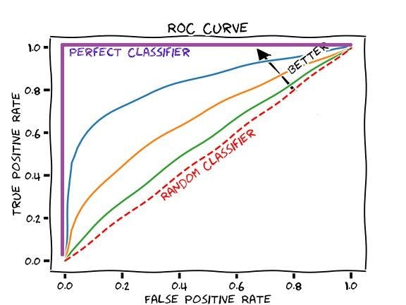
ROC curve sets a threshold for the classifier, which maximizes the true positives and minimizes the false positives. An ideal classifier will have a ROC curve where the graph shows a true positive of 100% with zero false positives. We usually measure how many true positives are gained with the classifications after an increment in false positives.
ROC curves show the trade-off between the true positive and positive rates with different measures which will assist the probability of thresholds. These curves are more appropriate for use when the observations present are balanced between different classes. This method first came into use in signal detection but now it is widely used in many areas.
A discrete classifier will return only the predicted class and will give a single point on the ROC space. On the other hand, a probabilistic classifier will give a probability or score that will reflect the degree wherein the data will either belong to one class or another. We can create a curve by changing the threshold for the scores.
What is AUC?
The area under the curve (AUC) is the most widely used metric that helps in model evaluation. It is used for general binary classification problems. AUC will measure the whole two-dimensional area that is available under the entire ROC curve.
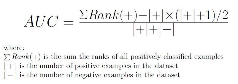
AUC of a classifier equals the probability of a randomly chosen positive higher or negative value. The AUC enables a classifier to distinguish between classes and can be used for summarizing the ROC curve. The higher the AUC value, the better the model’s performance in distinguishing between positive and negative classes.
Decoding ROC and AUC score
When you want to estimate the accuracy of a model, you should consider the area under the curve. An excellent model will pose an AUC nearer to the one that tells you it has good measures of separability.
A bad model will have an AUC nearer to zero, which will describe that it has the worst separability measures. It also means reciprocating the result and predicting the 0s to 1s and 1s to 0s. When an AUC is over 0.5, it means that the model doesn’t have a class division capacity present.
The AUC and ROC relationship
The AUC-ROC relationship is a valued metric and is used when you want to evaluate the performance in the classification models. It helps determine and find out the capability of a model in differentiating the classes. The judgment criteria are - the higher the AUC, the better the model, and vice versa.
The AUC-ROC curves will depict graphically. They show the connections and trade-offs between the specificity and sensitivity of each possible cut-off for a test being performed. The AUC-ROC curves can also depict a combination of tests being performed. The area under the curve will give an idea of the benefit of using the test for the underlying question.
The curves are also a performance measurement for the classification problems at different threshold settings. They serve as a criterion for measuring the test's discriminative ability and show the best result. When you look at the curve on the upper-most-left corner, you will know how the most efficient test can be performed.
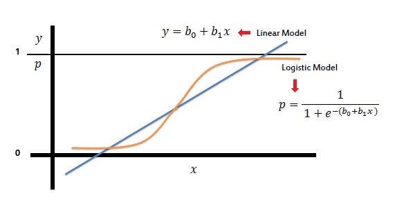
When you want to combine false positive and true positive rates to a metric, you can compute the former with different thresholds for the logistic regression. With this, you can now plot them on a single graphical representation.
The resulting curve we consider is the area under the curve. It is also the AUC-ROC curve.
AUC & ROC curve in Python
Using NumPy in Python, you can easily execute the AUC-ROC curve. You can implement the metric on various machine learning models that will help you explore the potential difference between the scores. Here are some examples with two models, the logistic regression and the Gaussian Naive Bayes:
You can apply the same formula with the help of Python as below:
The output for the above function would be approximately 0.9581.
To gain a deeper understanding, create a deterministic AUC-ROC plot. Here is what you should do when plotting for logistic regression:
When you consider Gaussian Naive Bayes, the image will be as below:
Image source
There might be differences in the results given. But, mainly the stochastic nature of the algorithm determines it. Again, the evaluation procedure used or the differences in the metric will also differ.
Performance metrics for classifications
The metrics you choose to evaluate a machine learning algorithm play a vital role as they highly influence the performance of machine learning models, which can be compared and measured.
Metrics possess a slightly different perspective from the loss functions. Loss functions will show the measure of model performance. They are used for training a machine learning model by optimizing it. For example, gradient descent, which is a first-order optimization algorithm, can help in differentiating between the model parameters.
However, the metrics are used for monitoring and evaluating the performance of the model during its training and testing phase, which is not required to be differentiated. The different characteristics in the result will be highly influenced by the metric itself.
Confusion matrix
The confusion matrix is the most basic classification metric. It is a table visualization of the truth labels and the model predictions. Each row will represent an instance in a predicted class and each column will represent the instances of an actual class.
The confusion matrix is not primarily a performance metric but it will offer the platform for other metrics which are required to provide better results. There are four classes of confusion matrix: true positive, true negative, false positive, and false negative.
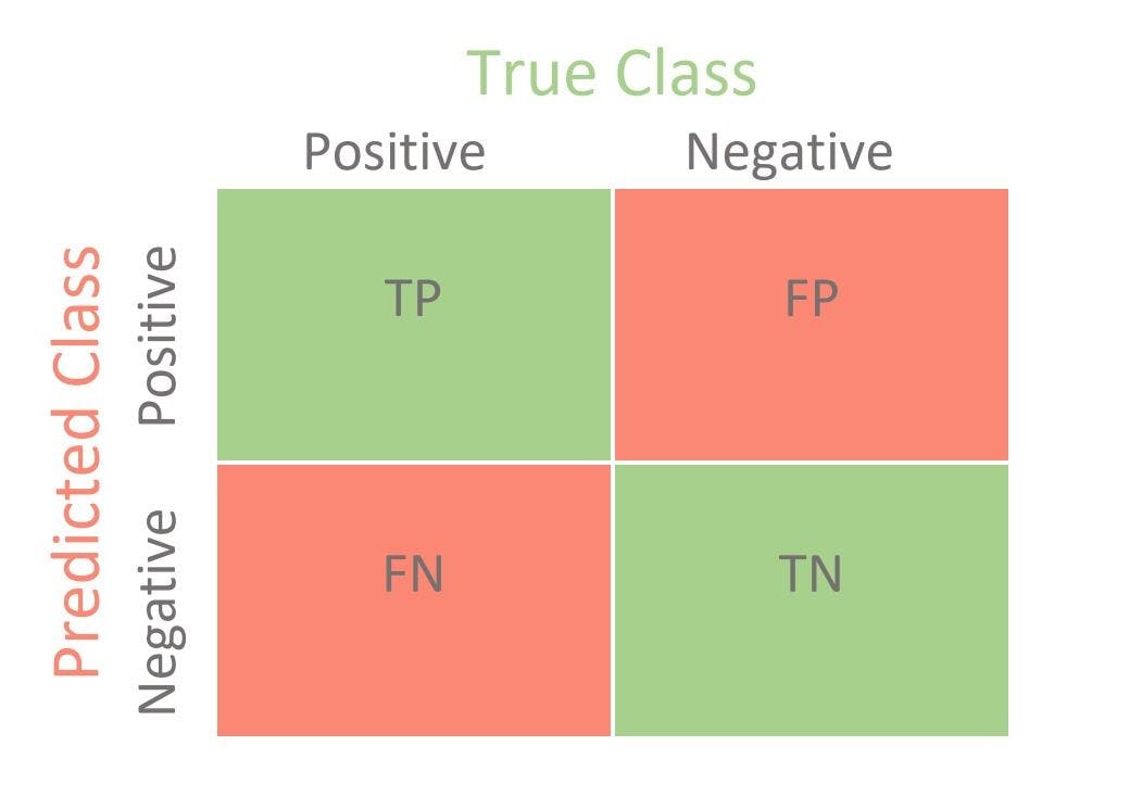
The true positive matrix represents how many positive classes in the created model are predicted correctly. The true negative matrix represents the correctly predicted negative classes in the created model. False-positive, on the other hand, signifies how many class samples in the created model are predicted incorrectly, and vice versa for the false negative.
Accuracy score
Accuracy score is the term of performance metrics used to measure the correct prediction of the classifier when they are compared to the overall data points. It is also the ratio of the units - the correct predictions and the total number of predictions that are made by that classifier. These additional performance metrics will help in offering more meaning to the model.
AUC-ROC
The AUC-ROC curve is used to visualize the performance of the classification model based on its rate of correct or incorrect classifications.
Precision-recall and F1 score
Precision-recall and the F1 score are the metrics values that can be obtained from a confusion matrix, which is based on true or false classifications. The recall is also known as the true positive or sensitivity, and the precision is the positive predictive value in the classification.
The AUC-ROC curve is a vital technique for determining and evaluating the performance of a created classification model. When you are performing this test you are not only increasing the value and correctness of a model but also improving the accuracy. With this method you can summarize the actual trade-off between the true positive rates and the predictive value in a predictive model, using various thresholds that play a vital role in classification problems.