How to Improve of Your Dashboards With Advanced Plots
•5 min read
- Languages, frameworks, tools, and trends
- Skills, interviews, and jobs

A dashboard, also called a canvas, is a single-page visualization that helps us track, analyze, and display data in a user-friendly way. It can assist with decision-making and deliver greater insights into improving an organization. It can also save time and increase productivity.
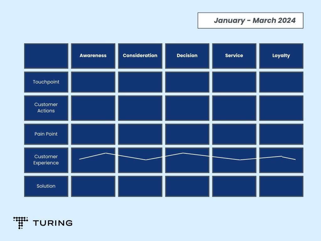
Take a look at the dashboard below, which is an example of a recruitment dashboard. It can assist hiring managers and uses key metrics such as recruitment costs, time to fill, time to hire, hiring pipeline, and offer acceptance rate. With these elements, hiring teams can monitor the performance of their recruitment.
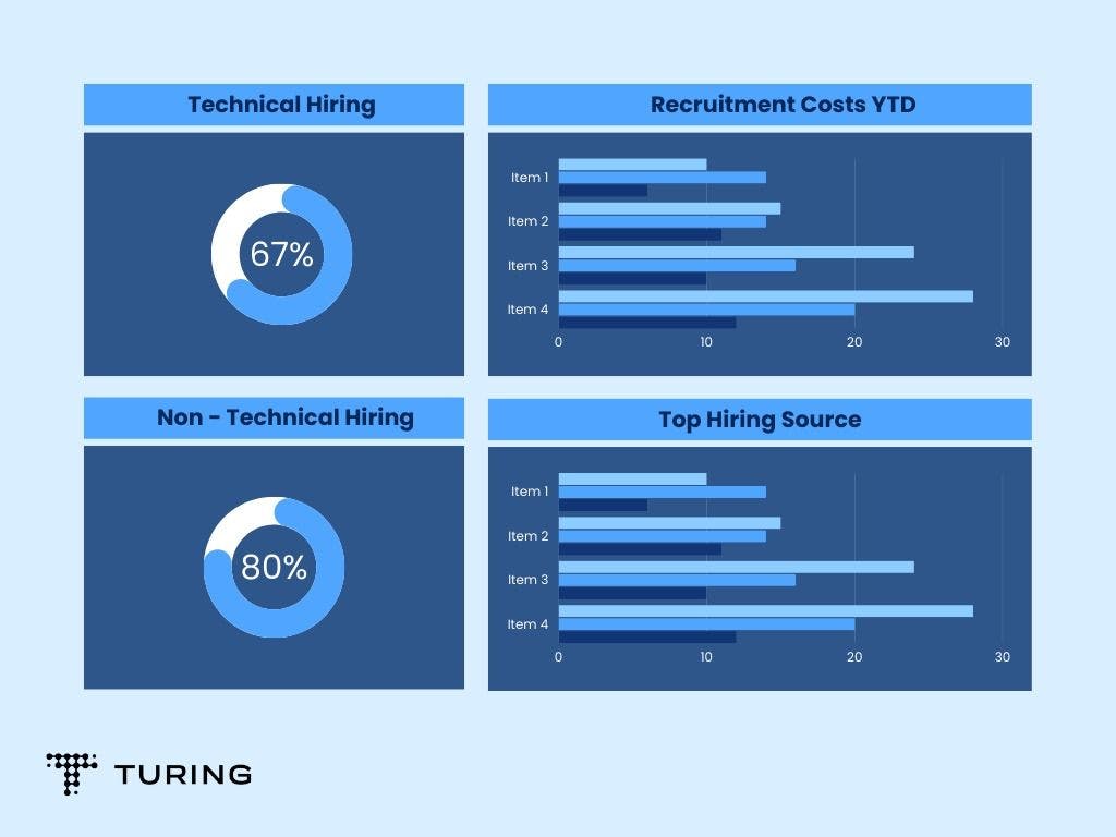
Similar dashboards can be created for retail data, hospital data, employee performance, marketing performance, etc. However, there are certain things to consider when building effective dashboards so that audiences get the right message.
This article will detail how to build better dashboards as well as improve their look and feel.
Understand your audience
Consider your audience, which may be your clients, colleagues, or even yourself. The dashboard should be created in such a way that it targets the right audience so that you can deliver the right message.
Be clear with your story
A dashboard is a place where your audience can explore data by themselves. Since it’s a channel for communication and the message you want to convey is the core part of your dashboard, you need to take these factors into consideration. Stay on point, analyze the data thoroughly, and understand the story behind it.
Keep your data and sources ready
Next, decide on the elements you want to use. You can employ sources such as Google Analytics, Google AdWords, etc., but make sure that your tool connects to all of them. Clean your data and prepare it so that it can be used to create a flawless dashboard. This step is necessary before moving on to building visualizations.
Sketch and visualize your idea
Sketch your ideas. This involves visualizing your dashboard, planning how to arrange your data in the canvas, what designs will best suit your data, etc. You can also check references for inspiration. A good source is Google’s Data Studio Report Gallery that showcases top templates from users that you can use.
Maintain data-ink ratio
Data-ink ratio is a concept that was introduced by Edward Tufte, a data visualization expert. He opined that a large share of the ink on a graphic should present data information with the ink changing as the data changes. Data-ink is the non-erasable core of a graphic and the non-redundant ink arranged in response to variation in the numbers represented.
In a dashboard, the majority of the ink should be data-ink. You should remove unnecessary items from your graph such as the grid on a chart, axis labels, etc.
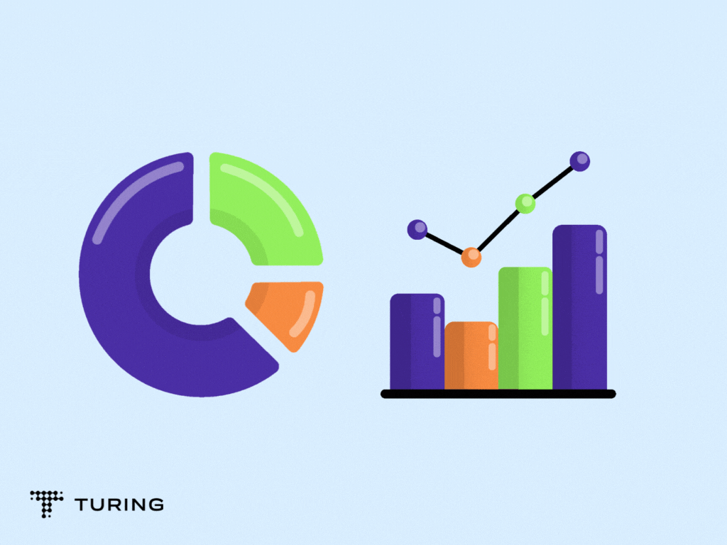
Choose the right visualization type
The goal is to make your data as easy to understand as possible for the viewer. Visualization type plays a big role in achieving this, so it’s important to choose the right one for your query.
Let’s take a look at some of the different types of visualizations and which you should choose.
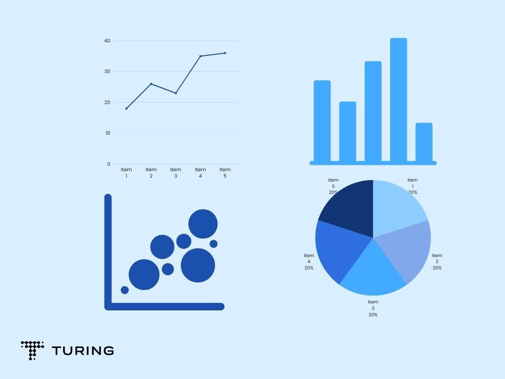
1. Line chart
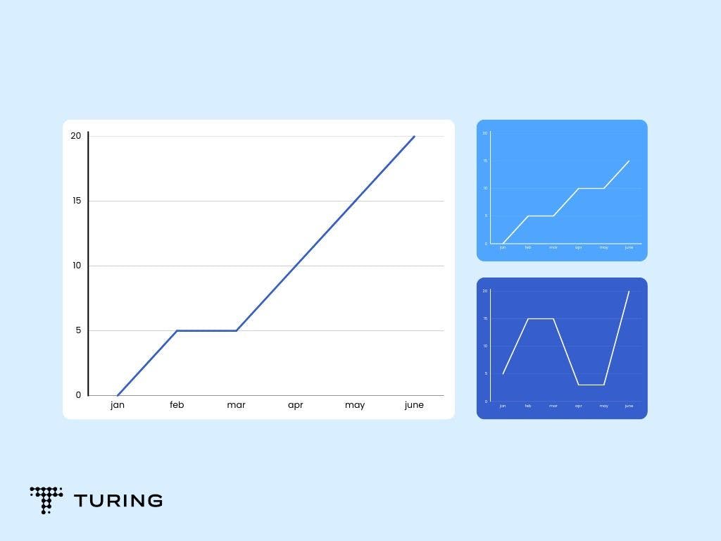
This type of chart is best suited for visualizing continuous data that changes over time. Use it if you wish to show trends instead of exact values. When the data is large, such that it cannot be represented in a bar chart, a line chart can be used.
2. Bar chart
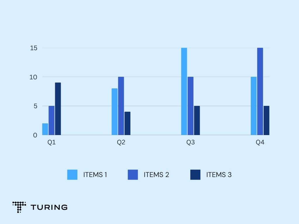
A bar chart can be used to compare and highlight different categories of bigger data. This can be useful when you have minimal space. A bar chart can represent both positive and negative values in the data. It’s advised not to use more than 10 bars in a graph as it may lead to overloading.
3. Tabular format
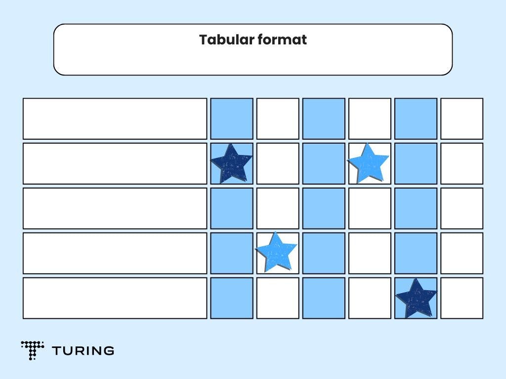
A tabular format can be used when you have the actual quantities of data. These quantities can be represented in rows and columns. The tabular format is not advisable in the case of finding trends or comparing categories of data.
4. Pie chart
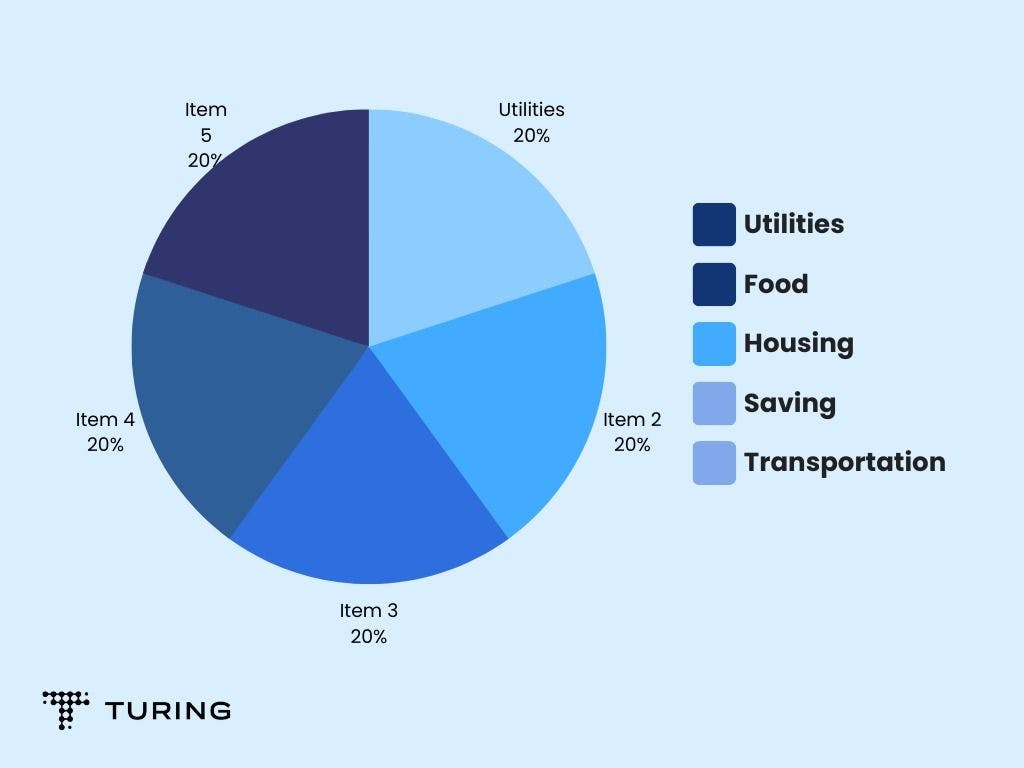
A pie chart is used to represent percentages or relative proportions of the whole dataset. It can have up to six divisions. You can also use a donut chart when the data is small.
5. Scatter plot
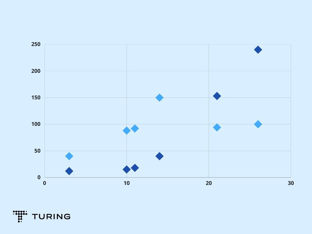
A scatter plot displays correlation and cluster in a dataset. It can be used if your dataset has numerical values on both the X and Y-axis.
6. Bubble chart
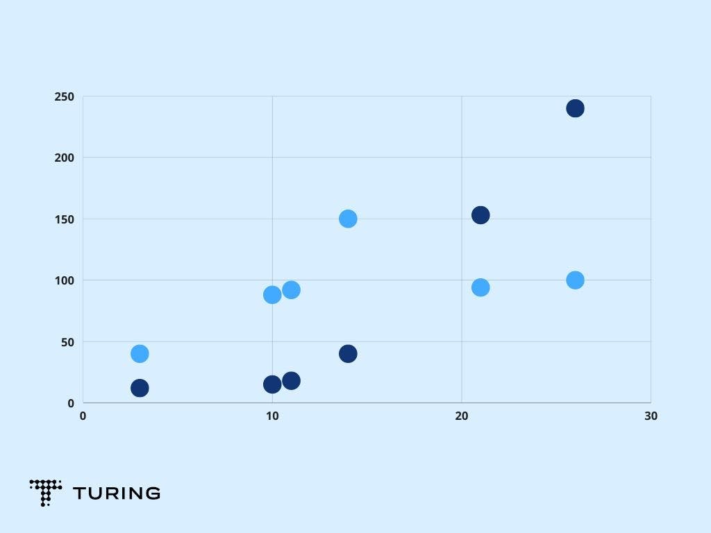
Similar to a scatter plot, a bubble chart can be used to represent the relation and distribution of independent values in the dataset. It can show entities in three dimensions.
7. Area chart
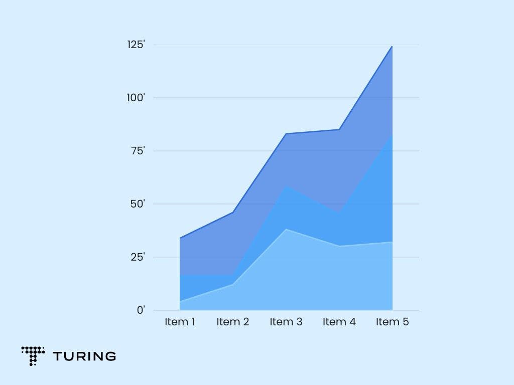
An area chart is best suited to show total values over time using percentages or numbers. It is not used with discrete datasets.
8. Heat map
A heat map can display the geographical distribution of data. Here, different values can be represented in different colors.
9. Gauge
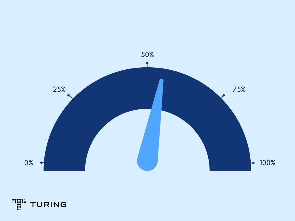
A gauge can be the best option when you want to show the range between the minimum and maximum values of datasets. It represents data in one dimension and, hence, provides limited information.
10. Animated chart
An animated chart allows users to drill deeper into information. It’s recommended for real-time datasets.
These are some of the methods you can use to represent data. However, before choosing the best one, you need to understand your data better.
Avoid too much information
Make sure you don’t overload your dashboard with too many charts and information as they will be difficult to analyze. Don’t reduce the size of your charts either as they may be tougher to read. If you have more charts and data, use a new page so that it doesn’t mess with the story of the other charts.
Choose colors wisely
Avoid using different colors for each visualization but use several colors to show different areas. Keep colors simple and avoid glaring hues. The best-designed dashboard always has a simple color scheme.
Before working on improving your dashboard, familiarize yourself with your tool. You should know which visualizations go where and how to design them in the first place. Focus on your message so that you can deliver it effectively.