Hamburger_menu.svg

FOR DEVELOPERS

How to Create Powerful Themes Using SCSS?

How to create powerful themes using SCSS

CSS comes as a lifesaver for designers. It not only helps with solutions to the challenges but also creates a powerful theme for a website. It leverages SASS features like functions and mixins and fuses your website with a breathtaking look while also maintaining its layout. However, the advanced version of CSS, that is SCSS or say superset of CSS, does wonders when a developer has to create a theme.

SCSS offers a closet of advanced features and proposes tons of opportunities to bring in the exact theme as an idea in the mind. You can shorten the codes using variables which is a great benefit over the conventional CSS. It contains all the features of that of CSS and even those that are not present in CSS. This makes it the first choice of developers to leverage for creating powerful themes.

So, in this SCSS tutorial, we are going to create an appealing theme with the superpowers of SCSS.

First, let’s understand CSS variables that were particularly useful while creating a theme for a web application.

CSS variables

CSS variables or CSS custom properties is the latest feature in CSS that lets you create dynamic variables. You can store any value in these variables and reuse them in your CSS codebase. We can also update it with JavaScript to use it for several different values within distinct selectors in your stylesheet.

However, they are used only for CSS property values. Unlike the preprocessor variables that can be used within media query declarations and preprocessor variables, these can’t be used with CSS variables. This is also the reason for naming the CSS variables as custom properties.

Theming is one of the applications of the CSS variables. It includes styling the various aspects of our website to enhance the overall aesthetics. You can change colors, fonts, and icon designs to make them clickable.

For instance: Let’s define a variable --primaryColor in three different places. We will set the background-color property to the --primaryColor value for the button and body elements.

* {
  box-sizing: border-box;
}

body {
  --primaryColor: #d452f1;
  background-color: var(--primaryColor);
  display: flex;
}

button {
  padding: 30px;
  border: none;
  font-size: 1.3rem;
  background-color: var(--primaryColor);
}

.my-element {
  --primaryColor: orange;
  padding: 40px;
  margin: 15px;
  border: 3px solid blue;
}

.my-element:nth-child(2n) {
  --primaryColor: #82f264;

Code source

Note: It may get difficult for you to see how SCSS and CSS variables can be used in conjunction with one another while using SCSS. It is usually the result of the disconnection when SCSS variables for shared properties work alongside separate CSS variables for theme properties without any cooperation.

Building a theme with SCSS

Creating powerful themes using SCSS.webp

Themes for a website or theming refers to styling various aspects of any website. Maintaining the look and feel of the platform often includes switching between colors, fonts, or icons.

So, let’s embark on creating a great theme using SCSS.

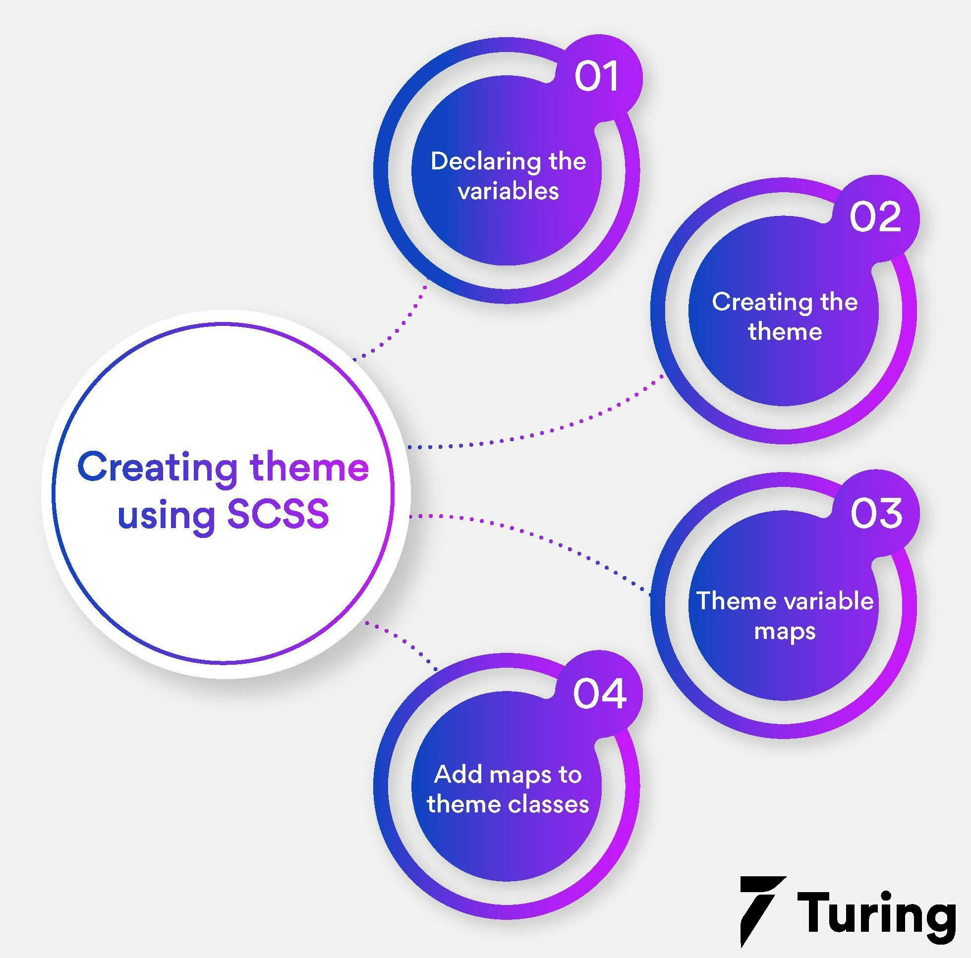
Step 1: Declaring the variables (_variables.scss)

To put together our CSS theme, we will start with light and dark classes.

We will declare the CSS variables for the same by assigning them to corresponding SCSS variables as given below.

$--theme-primary: --theme-primary;
$--theme-secondary: --theme-secondary;
$--theme-surface: --theme-surface;
$--theme-background: --theme-background;
$--theme-on-primary: --theme-on-primary;
$--theme-on-secondary: --theme-on-secondary;
$--theme-on-surface: --theme-on-surface;

Code source

Note: If you use CSS variables without the SCSS-specific syntax, you may encounter the following disadvantages.

  • A search and replace process across the project will be required while renaming the variables.
  • You won't be able to leverage auto-completion or IntelliSense.
  • You can only locate misspelled CSS variables with manual testing or by linters.

Step 2: Creating the theme (themes.scss)

The previous step is a key step that comes in handy in the procedure of building themes.

To start with, we will assign a value to each SCSS variable directly.

@import 'variables';
@import 'mixins';

// Don't do this
:root.light {
    #{$--theme-primary}: #d75894,
    #{$--theme-secondary}: #9b3dca,
    #{$--theme-surface}: #fff,
    #{$--theme-background}: #fafafa,
    #{$--theme-on-primary}: #fff,
    #{$--theme-on-secondary}: #fff,
    #{$--theme-on-surface}: #000,
}

Step 3: Theme variable maps

In order to keep the theme variables in the _variables.scss file and eliminate the need of #{} syntax, here’s what you can do.

Add the theme variables to maps. Furthermore, include these maps in CSS classes whenever required.

// Default theme
$theme-map-light: (
    $--theme-primary: #d75894,
    $--theme-secondary: #9b3dca,
    $--theme-surface: #fff,
    $--theme-background: #fafafa,
    $--theme-on-primary: #fff,
    $--theme-on-secondary: #fff,
    $--theme-on-surface: #000,
);

// Override the default light theme
$theme-map-dark: (
    $--theme-primary: #f34c83,
    $--theme-secondary: #c298dc,
    $--theme-surface: #2f2b2b,
    $--theme-background: #1b1918,
    $--theme-on-primary: #443e41,
    $--theme-on-secondary: #000,
    $--theme-on-surface: #f5f1f2,
);

Step 4: Add maps to theme classes

Next, add the maps to the theme classes using a simple “mixin” (_mixins.scss).

@mixin spread-map($map: ()) {
    @each $key, $value in $map {
        #{$key}: $value;
    }
}

Next, to include in themes, here’s what you need to do.

@import 'variables';
@import 'mixins';

:root.light {
    @include spread-map($theme-map-light);
}
:root.dark {
    @include spread-map($theme-map-dark);
}

Here’s the end to a basic theme creation using SCSS variables in a clean and concise manner.

Once your CSS is compiled, it will look like this.

:root.light {
  --theme-primary: #d75892;
  --theme-secondary: #9b3dca;
  --theme-surface: #fff;
  --theme-background: #fafafa;
  --theme-on-primary: #fff;
  --theme-on-secondary: #fff;
  --theme-on-surface: #000;
}
:root.dark {
  --theme-primary: #f34c8;
  --theme-secondary: #c298dc;
  --theme-surface: #2f2b2b;
  --theme-background: #1b1918;
  --theme-on-primary: #443e41;
  --theme-on-secondary: #000;
  --theme-on-surface: #f5f1f2;
}

A popular theme trend

One of the recent advancements experienced in themes is how one can switch between a light and dark theme. Just with a click on a button, a user can reverse the website colors from a dark text on a light background to light-colored text on a dark background.

It's understood that there are some subtle changes too along with it. These include maintaining an appropriate contrast with the background. If you wish to include this on your website for an enhanced user experience, here’s how you can proceed for your SCSS theme.

@import url("https://fonts.googleapis.com/css?family=Merriweather:400,400i,700");

* {
  box-sizing: border-box;
}

body {
  font-family: Merriweather, serif;
}

label,
main {
  background: var(--bg,orange);
  color: var(--text, white);
}

main {
  --gradDark: hsl(147, 100%, 95%);
  --gradLight: hsl(46, 95%, 79%);
  background: linear-gradient(to bottom, var(--gradDark), var(--gradLight));
  padding: 100px 60px 60px 60px;
  min-height: 100vh;
  text-align: center;
}

.wrapper {
  max-width: 851px;
  margin: 0 auto;
}

.theme-switch__input:checked ~ main,
.theme-switch__input:checked ~ label {
  --text:white;
}

.theme-switch__input:checked ~ main {
  --gradDark: hsl(198, 45%, 15%);
  --gradLight: hsl(198,40%,30%);
}


// Toggle switch
.theme-switch__input,
.theme-switch__label {
  position: absolute;
  z-index: 1;
}

.theme-switch__input {
  opacity: 0;
  
  &:hover,
  &:focus {
    + .theme-switch__label {
      background-color:yellow;
    }
    
    + .theme-switch__label span::after {
      background-color: lighten(green, 12%);
    }
  }
}

.theme-switch__label {
  padding: 13px;
  margin: 56px;
  transition: background-color 220ms ease-in-out;
  width:100px;
  height:57px;
  border-radius: 59px;
  text-align: center;
  background-color:yellow;
  box-shadow: -4px 5px 17px inset rgba(0, 0, 0, 0.4);
  
  &::before,
  &::after {
    font-size: 2rem;
    position: absolute;
    transform: translate3d(0, -40%, 0);
    top: 40%;
  }
  
  &::before {
    content: '\264C';
    right: 100%;
    margin-right: 16px;
    color: black;
  }
  
  &::after {
    content: '\264E';
    left: 100%;
    margin-left: 16px;
    color:green;
  }
  
  span {
    position: absolute;
    bottom: calc(100% + 16px);
    left: 0;
    width: 100%;
  }
  
  span::after {
    position: absolute;
    top: calc(100% + 25px);
    left: 7px;
    width: 51px;
    height: 51px;
    content: '';
    border-radius: 50%;
    background-color: lightGreen;
    transition: transform 220ms, background-color 220ms;
    box-shadow: -5px 5px 10px rgba(0, 0, 0, 0.4);
  }
}

// Checked label styles
.theme-switch__input:checked ~ .theme-switch__label {
    background-color: lightblue;
  
  &::before {
    color: lightblue;
  }
  
  &::after {
    color: yellow;
  }
  
  span::after {
    transform: translate3d(77px, 0, 0);
  }
}

What more you can do in SCSS theme?

1. Add complementary colors

If you wish to improve the aesthetics of the website theme, pick a complementary color. Use the initial “ --hue” value to calculate [calc ()] the complementary color with CSS variables. It would choose a contrasting hue from the opposite side of the color wheel. Here’s how you can do it.

.card {
--hue: 260;
--hueComplementary: calc(var(--hue, 23) + 181);
--th: hsl(var(--hue), 74%, 66%);
--thDark: hsl(var(--hue), 74%,40%);
--accent: hsl(var(--hueComplementary, var(--hue)), 74%, 66%);
}

Tip: We can also use “turn” units instead of degrees for calculating the hue value. It makes the visualization part easy mainly when we get into higher numbers.

2. Browser support

Some techniques do not work on older browsers. So if you wish to support your color theme on old browsers we will recommend you to not use CSS variables. The best way to have the browser support is by using feature queries.

.my-component {
background-color: #82f264;
}
@supports (--css: variables) {
.my-component {
--myVariable: #ef62e7;
background-color: var(--myVariable);
}
}

Note: As long as the syntax match, the @support declaration value doesn’t hold much worth.

Finally, you are well-acquainted with how you can build powerful themes using SCSS, sit tight and put your skills to work. Take advantage of all the information provided in this article to create a theme masterpiece for any platform.

FAQs

1. How to write a style in SCSS?

Ans: Start by choosing one or more elements with the help of classes, IDs, or other CSS selectors. Next, add styles.

2. Is SASS and SCSS the same?

Ans: SCSS is the main syntax for SASS that is built on top of the existing CSS syntax. SASS or Syntactically Awesome Style Sheets is a pre-processor scripting language that is interpreted or compiled into CSS.

3. Why use SCSS?

Ans: SCSS offers you the privilege to write easy and clean codes. You can write fewer CSS code lines in a program, which saves you time and effort in the long run. It offers good documentation and further provides you with all the information required online.

4. Can the browser read SCSS?

Ans: No, the browser can not read the SCSS code as browsers do not support them. You will have to first convert it to CSS.

5. How do you create application to use SCSS?

Ans: Start by creating a /demo folder in your drive. Create two folders namely /css and /scss inside the demo folder. Create a .scss file and go back to the CMD line. Make SASS “watch” both the folders created in /demo folder and edit the .scss file. Next you will watch SASS compile the same into a .css file.

6. Can I use SCSS and CSS together?

Ans: Yes, you can use SCSS and CSS together to leverage the access to functions, mixins, variables.

Author

  • How to Create Powerful Themes Using SCSS?

    Srishti Chaudhary

    Srishti is a competent content writer and marketer with expertise in niches like cloud tech, big data, web development, and digital marketing. She looks forward to grow her tech knowledge and skills.

Frequently Asked Questions

Start by choosing one or more elements with the help of classes, IDs, or other CSS selectors. Next, add styles.

No, the browser can not read the SCSS code as browsers do not support them. You will have to first convert it to CSS.

SCSS is the main syntax for SASS that is built on top of the existing CSS syntax. SASS or Syntactically Awesome Style Sheets is a pre-processor scripting language that is interpreted or compiled into CSS.

Start by creating a /demo folder in your drive. Create two folders namely /css and /scss inside the demo folder. Create a .scss file and go back to the CMD line. Make SASS “watch” both the folders created in /demo folder and edit the .scss file. Next you will watch SASS compile the same into a .css file.

SCSS offers you the privilege to write easy and clean codes. You can write fewer CSS code lines in a program, which saves you time and effort in the long run. It offers good documentation and further provides you with all the information required online.

Yes, you can use SCSS and CSS together to leverage the access to functions, mixins, variables.

View more FAQs
Press

Press

What’s up with Turing? Get the latest news about us here.
Blog

Blog

Know more about remote work. Checkout our blog here.
Contact

Contact

Have any questions? We’d love to hear from you.

Hire remote developers

Tell us the skills you need and we'll find the best developer for you in days, not weeks.